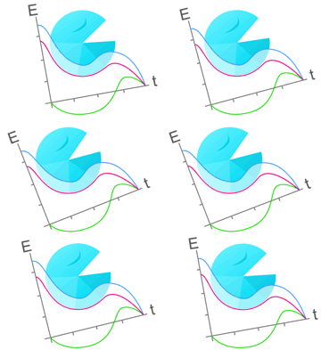
Both of these graphs are flattening out. In the case of the red SMC line, the effect is obvious: the maximum improvement occurs in the first 12 weeks.
The green line, representing the average extra benefit produced by the GET sessions, a smaller benefit than the SMC produced, is also flattening out. It fits a classic exponential decay pattern, with a maximum benefit of a 3.5 point improvement after many years. There are similar graphs for GET and CBT for each of the other assessments used - click on the tab or link to 3-Further Graphs to see them.
In most cases, the scores of the patients who only had Specialist Medical Care showed more than half of the overall improvement in the scores of the GET+SMC and of the CBT+SMC groups, and to use that combined score to reach targets gives a false impression of the effectiveness of GET and CBT. It is like setting the minimum height standard for entry into the police force at 5 feet 10 inches, then allowing candidates to stand on a box over three feet high. Interestingly the patient satisfaction with SMC (50%) was below the level of satisfaction with GET and CBT (82% or more), which suggests that patients overestimated the relative value of GET and CBT.
The next set of diagrams looks at the consequences of the average improvement being so low, and of the baseline score of the group (28·2) being so close to the end value of the scale (33). In this situation, it is very similar to the situation of describing the average salary of adults in the UK mentioned in the previous section where a few high earners lift the average (the mean) to an unrepresentative value. We do not have access to the raw data, so the example here is an illustration of the situation rather than an actual example.
|


