Sly Saint
Senior Member (Voting Rights)
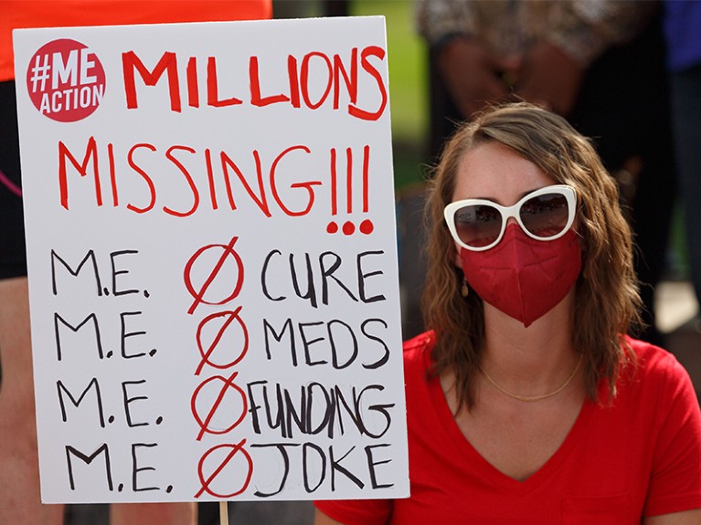
Demonstrators in Washington DC last September drew attention to the lack of funding for research into chronic fatigue syndrome, also known as myalgic encephalomyelitis.Credit: Bryan Olin Dozier/NurPhoto/Shutterstock
This year marks the 30th anniversary of a landmark US law. In 1993, it became compulsory to include women and under-represented groups in research and clinical trials funded by the US National Institutes of Health (NIH). Before the NIH Revitalization Act was passed, it was both normal and acceptable for drugs and vaccines to be tested only on men — or to exclude women who could become pregnant.
Thankfully, that has now changed. NIH data show that roughly half of participants in NIH-funded trials are women. The NIH has an office dedicated to research into women’s health and the agency mandates that researchers use both male and female animals in their studies, as appropriate. Health-research funders in Canada and Europe have adopted similar policies. The NIH has also contributed US$10 million for an Office of Autoimmune Disease Research, as directed by the US Congress — women make up approximately 80% of people with autoimmune diseases.
Our examination of the funding landscape for women’s health reveals that this analysis is one that not many researchers seem to have embarked on. Applied mathematician Arthur Mirin is among the few to have studied funding trends in women’s-health research in the United States. Mirin came out of retirement to do this after his daughter was diagnosed with chronic fatigue syndrome, also known as myalgic encephalomyelitis. Mirin wanted to find out how much NIH funding was available in a field where women make up three-quarters of those affected. He discovered that ME/CFS attracted the least amount of NIH funding when matched against disease burden2 — measured in disability-adjusted life years (DALYs), the cumulative number of years of healthy life lost because of illness, added to the years lost because of premature death. In 2019, for example, ME/CFS research received $15 million in NIH funding, for a disease that caused more than 700,000 DALYs in the United States.
Mirin later analysed3 NIH data for other diseases, including those that predominantly affect men such as liver or prostate cancer. In the majority of cases, diseases that predominantly affect women — such as migraines, headaches, anorexia and endometriosis — received funding that was a fraction of what was awarded for diseases that predominantly affected men, when funding amounts are matched to disease burden. This is unacceptable. Mirin rightly urged the NIH to do its own funding-versus-burden analysis, and to analyse correlations between funding and gender.
full article
https://www.nature.com/articles/d41586-023-01472-5
