ME/CFS Science Blog
Senior Member (Voting Rights)
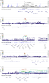
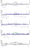
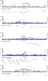
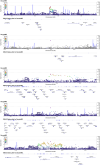
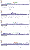
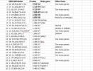
For the hit on chromosome 17, CA10 is the only candidate and it also clearly linked to neurons and synapses.
The exceptions are OLFM4 on chromosome 13, which has a clear immune connection (linked to severity of infection).
On chromosome 6p I think the butyrophilin3 and -2 homologues (BTN3A1, BTN3A2, BTN3A3, BTN2A1 and BTN2A2) seem most likely. The genes on the left that are closer are all part of a histone gene family, which encode the proteins that package DNA into chromatin - which seems less likely. The butyrophilin group also have a clear immune function: they are a immunoglobulin gene superfamily.
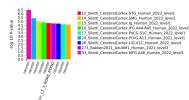
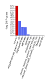
So if we focus on the close-by genes, the clearest hits seem to point to neurons/synapses.This gene encodes a protein that belongs to the carbonic anhydrase family of zinc metalloenzymes, which catalyze the reversible hydration of carbon dioxide in various biological processes. The protein encoded by this gene is an acatalytic member of the alpha-carbonic anhydrase subgroup, and it is thought to play a role in the central nervous system, especially in brain development. Multiple transcript variants encoding the same protein have been found for this gene.
The exceptions are OLFM4 on chromosome 13, which has a clear immune connection (linked to severity of infection).
On chromosome 6p I think the butyrophilin3 and -2 homologues (BTN3A1, BTN3A2, BTN3A3, BTN2A1 and BTN2A2) seem most likely. The genes on the left that are closer are all part of a histone gene family, which encode the proteins that package DNA into chromatin - which seems less likely. The butyrophilin group also have a clear immune function: they are a immunoglobulin gene superfamily.

