Multi-omics identifies lipid accumulation in Myalgic Encephalomyelitis/Chronic Fatigue Syndrome cell lines: a case-control study, 2026, Missailidis et

@Hutan I completely understand your reasoning and I hope I've made it clear that I wouldn't remotely characterize your comments in this thread as giving people unwarranted grief. I think it's really valuable to have your criticisms (and I was very happy to have your discussion on one of my own papers). I'm just trying to be open about a difference of opinion so that people reading this discussion can have the benefit of multiple perspectives.
 
I don't know if it's common practice or not - I'm pretty sure I've seen volcano plots where the significance line showed the cutoff of adjusted values (though I also found several that use .05 for the cutoff line just now, like you said).

Either way, I don't think you need to show where .05 is if you have corrected p-values. The number of items below .05 will be very different due to false positives just depending on how many features were tested, so it's kind of meaningless, but to an untrained eye or someone skimming, it looks like those three pathways are important.

I think better practice is making it clear on the plot which are actually significant. GWASs for example have around 10,000,000 features and they show a significance line at the p-value of interest. A line at .05 would be kind of pointless.
I see your point. Usually on my own plots I would have two different colors denoting p<0.05 and adj. p<0.05. I think the line is most often there because the first thing that someone in my field would want to know is whether we're looking at a situation of just a few weak hits that need to be investigated further with skepticism or a lot of strong signals that might not all get covered thoroughly in the text (and you wouldn't expect them to remember offhandedly what -log10(0.05) is).

Just as part of a wider discussion I think it's one small example of the difficulty striking a balance between writing for 1) other researchers in your field 2) scientists at large and 3) the general public (and the implications therein). If anyone has mastered that balance it certainly isn't me, despite my best efforts :emoji_sweat_smile:
 
In the PCA plot - why does the X axis even matter? It doesn’t look like it contributes anything to the separation.

If both contributed significantly, you’d have little overlap between the groups along both axes, e.g. with group 1 in the lower left and group 2 in the upper right. Now it’s just top and bottom. So the analysis seems redundant at best or misleading at worst, at least to an economist..
I think the line is most often there because the first thing that someone in my field would want to know is whether we're looking at a situation of just a few weak hits that need to be investigated further with skepticism or a lot of strong signals that might not all get covered thoroughly in the text (and you wouldn't expect them to remember offhandedly what -log10(0.05) is).
That seems like the kind of bad practice that is bound to end up causing some confusion down the line. I don’t doubt that you or @DMissa might think that way because you are very rigorous, but judging by the papers we read here every day most people tend to make a muddle out of things.

At the very least, the adjusted values could be front and centre, and the unadjusted values can be relegated to either a second figure or the supplements.
 
Honestly, I'm a bit flabbergasted. After going to all that effort to highlight the problem with the use of a PCA in the Tate paper, one of my favourite ME/CFS scientists is aware of that and still commits even worse PCA abuse.... I don't understand why you would choose to do a PCA in this way.

I've checked a number of guides on the use of PCA and none recommend it for use in this situation of only two highly selected features, when interpretability of the features is what is needed. I don't think that any statistician would disagree.

The figure caption says 'PCA plot developed using PC(O-38:4) and DG(36:2) levels separates ME/CFS and HC LCLs perfectly.' But, I could take an entirely random dataset of 454 features, choose the two most differentiating independent features and produce a PCA that looks much like the one you have there. It's essentially extreme cherrypicking, ignoring the multiple comparisons it took to find those two differentiating features.

The fact that the two most differentiating features out of 454 features can separate the two groups is not at all remarkable. What is truly interesting here are the identities of the particular features that are separating the ME/CFS cells from the controls. We want to start thinking about why those particular features and not other ones? Could they tell us something useful about ME/CFS rather than just be a random result?

So, if you want to plot them against each other, please show their names on the chart, don't bury their identities under the PC1 and PC2 labels and confuse people about what has been found.
It was already in the paper before that other thread existed. So, I thought, okay, this debate is extending beyond my confident knowledge of statistics and I don't want to do something wrong, so let's consult a colleague (an Accredited Statistician of the Statistical Society of Australia) who we have analysed data with before, and who has used PCA similarly in the past. They confirmed to me that it was a valid application of it, so I kept it there.
But, I am willing to bet that it will be cited as supporting such study.
I can only present things as I observe them, as neutrally and comprehensively and systematically as I can endeavour to. If people choose to misappropriate things put forward in such a way I am not responsible for that. I have put appropriate qualifiers in the immediately adjacent text. If people don't read the text in good faith what can I do?
We'll have advocates lifting the PCA and suggesting that there are biomarkers that can identify ME/CFS and that DG(36:2) has some vital role in that.
Which is why right next to the PCA, in the text itself, I wrote "this is not to suggest these lipids as potential biomarkers". Nobody who understands any biology or wields any significant influence is going to see two lipids from transformed cell lines in 15 people and determine it to be a prospective biomarker, especially if it blows up somehow on twitter and I, the author, step in and say: sorry, no.
I guess I'd ask @DMissa, why are you so set on including a PCA in this paper? What do you think it conveys to the reader that a scatter chart does not?
It's not a matter of "so set" - I am not feeling particularly impassioned by this (I am open to what you are saying). At the time of its inclusion the rationale was to visually illustrate the group to group clustering produced by the most significant lipids moving in either direction (because they can be interconverted, and stand-out depletions or accumulations might be related, whether directly or indirectly by other intermediates that can have either altered or unaltered steady state levels according to flux through the relevant reactions). Abnormal interconversion is actually one of the most likely drivers of accumulation (see discussion for potential explanations being narrowed down). I got the idea from an application of PCA by a statistician in another paper where two functionally related transcripts were used to produce clusters. I later saw that thread where it was brought into question so I sought expert advice and then proceeded accordingly, in good faith. Maybe it's an arguably redundant application of PCA where another scatter may have sufficed. I am happy to accept that and to approach similar issues in future analyses differently.
I think I need to defend myself or at least explain why I'm banging on about these things. It's not out of pettiness or some personal need to be right.
For the record I require no explanation and understand the reasons.

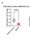
I will also note that I only mentioned PC(O-38:4) in the Abstract because its scatter is the most straightforward evidence of group separation.
 
Last edited:
That seems like the kind of bad practice that is bound to end up causing some confusion down the line. I don’t doubt that you or @DMissa might think that way because you are very rigorous, but judging by the papers we read here every day most people tend to make a muddle out of things.
Maybe, maybe not. I guess coming from environments where perfectionism was expected to the point of paralysis, I have just learned the hard way that if I try to compensate for the many ways that someone barely giving my work the time of day and with little context-specific knowledge might possibly misinterpret things, my work will very much suffer in the other direction.
 
iMarkup_20260108_162040.jpg
That figure is really quite striking. From the stats in the supplementary files, it doesn't look like any other lipid came close. q=.0017 and FC=0.32 for this lipid versus q=0.79 and FC=0.64 for the next most significant one (PE(O-40:5)).

I haven't had a chance to really study the methods (and am not sure I'd understand if I did), but can you think of any way this could be an artifact, @DMissa? Were any of the sample processing steps done fully separately for the ME/CFS and HC groups?
So yeah this is why in the last response to Hutan I'd mentioned lipids that clearly stood out as opposed to the whole dataset for the PCA - it was clear that the top end, particularly this one, were behaving far more dramatically different than the rest, so this behaviour formed part of the rationale for taking the most elevated and most reduced.

All of the samples were processed the same way, at the same time, by the same pair of hands, so I can't think of any systematic technical bias that would be present.
 
All of the samples were processed the same way, at the same time, by the same pair of hands, so I can't think of any systematic technical bias that would be present.
Just to cover all the bases..were the groups mixed up for all the measurement steps? So the order of testing would be something like HC, HC, ME, HC, ME, ME, HC, ME, ME, HC.

Or was any step more like all the HCs go first, then the ME/CFS samples got tested next, even if right after? Just to rule out something like the machine malfunctioning halfway through the samples. (Sorry, I don't know if there are any steps like this where samples are processed one by one.)

Otherwise, it does seem like something to try to replicate asap. [Edit: I'd also be interested to see if age correlates with this lipid specifically.]

Edit: It looks like you've got some symptom scores for the ME/CFS group in the form of weighted standing time, though I'm not sure what exactly that is. Maybe you can see if the significant lipid's level correlates to that or any other score?

Edit 2: I found a description of weighted standing time. It's basically how many minutes a person can stand (max 20 minutes) multiplied by a value that is lower the more difficulty the person had with standing, based on a subjective rating.
The CFS Discovery orthostatic intolerance (standing test) protocol is described in detail elsewhere [10]. Briefly, participants were required to stand, unaided for a maximum of 20 min after a period of repose necessary for baseline (pre-standing) measurements. Heart rate, blood pressure and oxygen saturations were measured at baseline, and subsequently every 2 min during standing. Parameters were measured at the end of the task (either capped at 20 min, or when the participant could no longer continue) and after 3 min of rest following task completion. A difficulty score was also recorded by the nurse, a subjective measure of how difficult the patient found the standing test. A score between 0 and 10 was recorded (0 = no difficulty standing, 10 = support required to stand, pre-syncope). For this study, two further scores were added, with a subjective score of 12 indicating standing difficulty to the point that the standing test was terminated at less than 20 min (but greater than 10 min), and a score of 14 represented the most extreme difficulty where standing was only possible for 10 min, or less.

With the majority of the ME/CFS cohort achieving a standing time of 20 min, comparisons of standing times for ME/CFS and healthy control cohorts were not informative. To weight the standing time in relation to subjective standing difficulty, and produce a single fatigue response variable, the time standing (maximum 20 min, measured at 2 min intervals) and standing difficulty were combined to produce one measure called the “Weighted Standing Time” (WST). The WST (minutes) was calculated by the following equation:

Weighted standing time (WST) = Time standing (mins) x (1-(Difficulty/14)).
 
Last edited:
Thank you so much, @DMissa , to you and your colleagues for doing this work and for writing it up so carefully.
Main finding:
TLDR: immortalised B cells from pwME clearly have more lipid content, especially molecules that would lead to more rigid cell membranes. Next, this all needs to be verified in fresh, unimmortalised cells from better-characterised patients and in relation to relevant potential issues such as BCR engagement.
I really appreciated your clear posts summarising the study. My brain is not working at the moment, so I cannot read the paper (and have learned not to read pre-prints because the line spacing, line numbers and diagonal stamps obliterate my ability to understand text!) So your posts are very helpful.

I think I'm probably not alone in welcoming researchers explaining their research in as simple a way as possible to start with, because of our cognitive challenges. I would love if every researcher started with the few sentences they would tell their child/niece/nephew aged 3-9 when the latter asked "What did you do? What did you find? What does that mean?"

So please feel free to go even simpler first, before catering to the people who are able to engage with it on a high level.

I really didn't try to game or push anything in particular and I hope (and believe) that this is apparent in the text. I actually had a disagreement with a reviewer in a prior submission to another journal that was rejected... they wanted more of a "story" and claimed the data read too much like a neutral report of the observations. That was my intention and I didn't budge on it even to my own disadvantage in that instance. The intention was to, in the Results: have all of the data included and left to speak for itself, with some context but minimum of interpretation, and in the Discussion: then focus on interpretation and put forward the most compelling avenues for future work in the Conclusions.

As I say, it is there for completeness, transparency, and just in case it is a piece of the puzzle. The focus is firmly on the more clear results.
I really appreciate that approach to writing up your results.

I have been unable to work for some weeks due to vertigo
Oh that's horrible. Hope it will ease for you as soon as possible.

That's why these findings make more sense to me as a sign of different signaling exposure rather than a fundamental lipid problem

Important takeaway for the purposes of this paper is that this receptor binding can trigger an epigenetic shift that can persist in the cell even if its not actively receiving a certain signal anymore. The idea is that this paper's lipid signature might be the result of some of those lipid-related gene programs getting switched on because of prior exposure to different signals (or the same signals in different amounts/proportions) in ME/CFS vs. controls.
Really appreciate your explanations, @jnmaciuch, very helpful.

I understand I come across as more skeptical towards a completely zoomed-out approach. I think a lot of that comes from knowing that if, for example, we lived in a world where humanity didn't have a fraction of its current understanding about adaptive immunity, research into something like lupus would probably look much the same as it currently does in ME/CFS. If we only knew about things like complement from its connection to synapses in alzheimers, GWAS and various lab findings might lead people to think lupus was an issue of synapses. Or we might have people use HLA associations and EBV epidemiology in lupus to claim that it's caused by EBV reactivation in tissue because EBV enters cells through HLA binding. And we would also have tons of various metabolomic and lipidomic findings in lupus that, unbeknownst to us, were actually downstream of the disease process. So information does have to be considered all together--but a coherent biological story is much more useful for putting pieces together than scattershot context.
I found this really helpful too.

So while BMI is a possible confounding factor I don't suspect it would be in this case. I also don't suspect this particular group had many or even any pwME who were obese (obesity being a factor that may associate with elevated circulating lipid levels which could contribute to cellular hyperlipidaemia). What we are measuring here is pretty far removed from blood. It would have to result from a pretty stable epigenetic (outside of the regions altered by EBV) or regulatory effect.
Thank you for that explanation about whether potential differences between groups in BMI could have confounded your results.

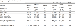
I have a related question. I have a memory of Armstrong +/- other Australian researchers talking about the potential usefulness of a ketogenic diet for people with ME/CFS many years ago. (I hope that my memory is correct - if not, please correct me.) Is there any chance that these results could be confounded by diets with unusually high fat intake, whether ketogenic or paleo or due to difficulty preparing food?

In the NIH study by Walitt et al. 2024, there did seem to be possible differences between patients and controls in fat consumption when looking at food records:

1768565230456.png

Tagging @Midnattsol who may be able to reassure me that a ketogenic diet would not explain @DMissa's results.
 
Last edited:
Back
Top Bottom