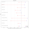
Cardiopulmonary and metabolic responses during a 2-day CPET in [ME/CFS]: translating reduced oxygen consumption [...], Keller et al, 2024

I used Youden's J statistic the find the optimal threshold, which is just (true positive rate - false positive rate) or written differently sensitivity - (1-specificity). I think visually you can interpret it as the point on the ROC curve that is furthest away from the red dotted diagonal.

For VO2_max the optimal threshold was approximately -9.28% which had a specificity of 90% but a sensitivity of only 36%. In other words: 10% of HC are under the line, 90% above, around a third of MECFS are under the threshold, and the other 2/3rds above it.

upload_2024-9-14_10-33-3.png

upload_2024-9-14_10-34-42.png
 
Nice visualization, thanks. One suggestion: it might more intuitive if both graphs have the same scale, so that difference in VO2 and wkld can be compared. Now they look the same size but VO2 has a scale from -20 to 10 and wkld from -50 to 20.

Good idea. I've also estimated the data for Lien 2019 by using an onscreen ruler to measure the heights of the means on the charts.


VO2_peak (ml_kg_min)_dumbbell.png

wkld_AT (W)_dumbbell.png

Lien 2019 also appears to have checked workload at lactate turnpoint (LT) and onset of blood lactate accumulation (OBLA), on top of peak and gas exchange threshold (also known as ventilatory anaerobic threshold or VAT). I think gas exchange threshold and LT are different methods of trying to identify an anaerobic threshold. I'm guessing all the studies used gas exchange for the anaerobic threshold, but I'll have to double check that.

No significant differences at LT, but "the power output at OBLA increased significantly in controls and decreased significantly in patients from CPET1 to CPET2 (Fig. 6E), and the difference in power output at OBLA from CPET1 to CPET2 was significantly different between groups".

phy214138-fig-0006-m.jpg

https://en.wikipedia.org/wiki/Lactate_threshold
Lactate inflection point (LIP) [lactate threshold] is the exercise intensity at which the blood concentration of lactate and/or lactic acid begins to increase rapidly.[1] It is often expressed as 85% of maximum heart rate or 75% of maximum oxygen intake.[2] When exercising at or below the lactate threshold, any lactate produced by the muscles is removed by the body without it building up.[3]

The onset of blood lactate accumulation (OBLA) is often confused with the lactate threshold. With an exercise intensity higher than the threshold the lactate production exceeds the rate at which it can be broken down. The blood lactate concentration will show an increase equal to 4.0 mM; it then accumulates in the muscle and then moves to the bloodstream.[2]
 
I've now recalculated with the correct comparison of ME/CFS patients but it is still the same large difference:

This calculation first takes the means, then expresses the change in means as a percentage
(day2_MECFS.mean() - day1_MECFS.mean()) / day1_MECFS.mean() * 100
Result: 9.4%

This one takes the percentage change for each participant first, then takes the mean
((day2_MECFS - day1_MECFS) / day1_MECFS).mean() * 100
Result: 0.08%
Had a closer look at this.

The problem is that taking the means first and then their percentage change is sometimes different from taking the percentage change per participant first and then taking the mean. This is especially a problem with wkld_AT and time_sec_AT:

upload_2024-9-14_17-50-59.png

I thought this was due to the higher values have the greatest declines but it is actually the opposite: it were the smallest values that had the biggest increase, that messed up the equation. Because their baseline values are small, their percentage increases are huge even though their absolute increases are not that remarkable.

upload_2024-9-14_17-51-54.png

If I exclude the 4 MECFS patients with an increase of more than 100%, the problem described above disappeared (the Error_percentage becomes small). Another reason to think a measurement error happened in those 4 participants and that they perhaps could be excluded.
 
Had a closer look at this.

The problem is that taking the means first and then their percentage change is sometimes different from taking the percentage change per participant first and then taking the mean. This is especially a problem with wkld_AT and time_sec_AT:

View attachment 23341

I thought this was due to the higher values have the greatest declines but it is actually the opposite: it were the smallest values that had the biggest increase, that messed up the equation. Because their baseline values are small, their percentage increases are huge even though their absolute increases are not that remarkable.

View attachment 23342

If I exclude the 4 MECFS patients with an increase of more than 100%, the problem described above disappeared (the Error_percentage becomes small). Another reason to think a measurement error happened in those 4 participants and that they perhaps could be excluded.

Yeah, I get the same numbers. It's pretty crazy it changes it that much.

I plotted the outliers day 1 and 2 AT workloads to compare with everyone else:

swarmplots.png
They're low, but I'd be worried about removing them, since it's not like they're all below everyone else readings making it look like something's definitely wrong. If what I was saying before is right that workload is instantaneous or even averaged over only a short period of time, the test would have some inherent variability, depending on if people happen to slow down some right before hitting AT, and these would just be the outliers of that variability who slowed down a lot.
 
I plotted the outliers day 1 and 2 AT workloads to compare with everyone else:
Excellent.

They're low, but I'd be worried about removing them, since it's not like they're all below everyone else readings making it look like something's definitely wrong.
Agree: their values on each day do not seem very abnormal, not extreme values that suggest a measurement error or something like that.
 
I emailed Betsy Keller about PI-026 looking like bad data and she responded:
Thank you for bringing this to our attention. You are correct and we are in the process of amending the MapMECFS data set.

I can tell you that the corrected data for test 1 is still very similar to test 2 for most variables, even though this was an ME/CFS subject. I’ll let you know once we have the correction completed.
 
I think that the data in Davenport 2020 and Snell 2013 are the same data. They are from the same research group, both on 51 ME/CFS patients and 10 controls. The data matches almost perfectly except for a major difference for workload at the ventilatory threshold.

- Snell 2013 reported a difference from 49.51W to 22.2W in the ME/CFS group which is an enormous effect size (cohen d of 2.2).

- Davenport 2020 reported a difference from 49.5W to 44.1W which seems more realistic.
So perhaps the 22.2 was an error of some sort. Bit unfortunate that the Davenport paper does not make it clear that this is the same data they reported previously.

Workload at the ventilatory threshold was the only measurement were the change between tests was significantly different between groups (significant group x time interaction, p < 0.001). But it was partly because the controls increased with approximately 10% from 58W to 63.5W while ME/CFS patients decreased with ca. 10%.

What I don't understand is that in figure 2B, which shows difference in workload_AT, the sedentary controls all have negative values. If their means go up, there should be (mostly) positive values above 0. So perhaps this is an error as well, or am I reading this wrong?

upload_2024-9-14_23-28-40.png
 
So looking at the meta charts comparing studies, I was starting to think more and more that a 2-day CPET simply measures deconditioning, given the latest, possibly best matched control group for "fitness" showed the largest decrease in controls as well. And a couple of the other "sedentary" control groups also showed decreases.

So I wanted to see if there's a correlation between means of baseline VO2peak and AT workload for each study. VO2peak is supposedly a decent metric of physical fitness or deconditioning. So if the studies with control groups with the lowest VO2 at baseline showed the largest day to day decreases in workload, I'd think that's a clue that it's just about deconditioning.

Here are all the study points. The same studies from the meta charts I made earlier.

all_studies_VO2peak_vs_wkld_diff.png

Blue dots, healthy controls, is what I'm interested in. ME/CFS, sure I expect a correlation. The hypothesis is if they're more sick, they both are more deconditioned from being sedentary (lower VO2) and the whole CPET hypothesis is they have larger decreases in workload from PEM. The large correlation of the combined phenotypes also makes sense, since most of the ME/CFS are clustered in the bottom left corner for the reason just given, and the HCs are more spread out along the top.

There does not seem to be a strong correlation for controls. I checked, and both features for the HC groups pass Shapiro-Wilk normality test (ME/CFS workload difference does not).
upload_2024-9-14_17-21-18.png

So I think I can use Pearson's correlation for just the studies' control means:
upload_2024-9-14_17-4-50.png

Just in case, here's Spearman correlation on the same metrics:
upload_2024-9-14_17-23-32.png

No correlation for either difference metric.

I posted this before, but here are the correlations again for individual participants in the Keller study:
keller_VO2peak_wkld_diff.png

In this case, for controls, the distribution for baseline VO2peak and VO2peak difference did not pass normality, so I'm not sure the r values above apply.
upload_2024-9-14_17-14-2.png

So I did Spearman correlation with this one:
Screenshot from 2024-09-14 17-16-05.png

Again no correlation in controls.

So I don't see any indication that fitness defined by baseline VO2peak has anything to do with decreases in performance on workload at AT or VO2peak on day 2.

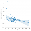
And just for completeness, here are the scatter plots for baseline VO2peak vs VO2peak difference for all studies and for Keller individuals:

All studies:
all_studies_VO2peak_vs_VO2peak_diff.png

Keller 2024:
keller_VO2peak_VO2peak_diff.png

Interestingly, the charts look like the more fit you are, the worse you do on the 2-day CPET in terms of peak VO2 for all groups, though none are significant.
 

Attachments

  • upload_2024-9-14_17-31-48.png
    upload_2024-9-14_17-31-48.png
    17.3 KB · Views: 2
Last edited:
The data of Lien et al. 2019 on workload at the ventilatory threshold also look weird. How can there be so many datapoints with the exact same value if these represent changes from CPET1 to CPET2.

upload_2024-9-14_23-34-53.png

Franklin discarded these in his thesis because Lien et al. could not clarify why the data looked like this. He wrote on page 93
Although five of the included papers provided WR at AT data, only four of these studies were included in this analysis. The information provided relating to change in WR at AT in Lien et al., (2019) (in Figure 5(D) of this paper) displayed 2 results at +10W, 2 results at -10W and the remaining values on exactly 0W. These results seemed highly improbable and therefore the Lien research team were contacted directly to clarify these findings. However, this data was unable to be verified with the Lien research group and therefore this data set was excluded from the analysis
 
I think that the data in Davenport 2020 and Snell 2013 are the same data. They are from the same research group, both on 51 ME/CFS patients and 10 controls. The data matches almost perfectly except for a major difference for workload at the ventilatory threshold.

- Snell 2013 reported a difference from 49.51W to 22.2W in the ME/CFS group which is an enormous effect size (cohen d of 2.2).

- Davenport 2020 reported a difference from 49.5W to 44.1W which seems more realistic.
So perhaps the 22.2 was an error of some sort. Bit unfortunate that the Davenport paper does not make it clear that this is the same data they reported previously.

Good catch! Yeah, I assume the 22.2 is wrong. If so, it seems it should be corrected, because the error is so large. Snell was included in the meta analysis you posted.

Do you know what new research was done in the Davenport paper? I haven't read either Snell or Davenport fully yet.

What I don't understand is that in figure 2B, which shows difference in workload_AT, the sedentary controls all have negative values. If their means go up, there should be (mostly) positive values above 0. So perhaps this is an error as well, or am I reading this wrong?

upload_2024-9-14_23-28-40-png.23362

I've never seen this kind of chart. From a quick search, I think the x axis is the mean of the two tests for a given participant, and the y axis is the difference between the two tests. Mean workload seems okay. But difference isn't making a whole lot of sense to me. Since workload went up in controls, at least some of the dots should be above 0. I thought maybe it's flipped and is Day 1 - Day 2, which would make increases negative, but then ME/CFS should have lots of positive values since they decreased as a group, but it's mostly negative for them too.
 
Edit: For some reason, this program, Orange Data Mining, is giving a wrong correlation when there's a missing value (AT_wkld in VanNess), so screenshots of correlations were wrong. Removing screenshots and replacing with Python output.

----

In light of the issues with the Snell and Lien studies, I removed those from the fitness correlation analysis. Although it looks like a moderate correlation in controls...

all_studies_no_snell_lien_VO2peak_vs_wkld_diff.png

It is still not significant:

All studies, healthy cohort, D1_max_VO2 : AT_wkld_diff_percentage
Pearson correlation: 0.323, p-value: 0.435
Spearman correlation: 0.357, p-value: 0.385

All studies, healthy cohort, D1_max_VO2 : max_VO2_diff_percentage
Pearson correlation: 0.155, p-value: 0.691
Spearman correlation: 0.333, p-value: 0.381

And because it doesn't make a lot of sense to have both Keller full cohort and Keller matched cohort, one being a subset of the other, here it is with the matched cohort removed:

all_studies_no_snell_lien_fitmatch_VO2peak_vs_wkld_diff.png

All studies, healthy cohort, D1_max_VO2 : AT_wkld_diff_percentage
Pearson correlation: 0.105, p-value: 0.823
Spearman correlation: 0.036, p-value: 0.939

All studies, healthy cohort, D1_max_VO2 : max_VO2_diff_percentage
Pearson correlation: 0.015, p-value: 0.971
Spearman correlation: 0.119, p-value: 0.779


Edit: And although I don't think it's very relevant for the reasons in the last post, here are the correlations if including both ME/CFS and controls, since it looks like a decent correlation in the chart. Not significant.


All studies, both cohorts, D1_max_VO2 : max_VO2_diff_percentage
Pearson correlation: 0.291, p-value: 0.274
Spearman correlation: 0.426, p-value: 0.099

All studies, both cohorts, D1_max_VO2 : AT_wkld_diff_percentage
Pearson correlation: 0.421, p-value: 0.133
Spearman correlation: 0.433, p-value: 0.122

---

So to summarize:
  • Looking at mean values for non-ME cohorts from 7 different studies - no correlation between VO2peak "fitness" proxy and decrease in workload at AT or VO2 at peak on day 2.
  • Looking at individual values from 71 people without ME in Keller - also no correlation.
 
Last edited:
Unfortunately, I think the data from Van Campen 2021 (both the female and the male study) look suspicious. In the male, study all the ME/CFS patients had increases while all controls with idiopathic fatigue had increases. And this was the case for VO2 and workload at both peak and AT vales.

This seems nearly impossible to me. I suspect that they used the results of this test to determine if a patients should be diagnosed with ME/CFS or ICF, so it is a bit like circular reasoning.

upload_2024-9-15_14-51-8.png

In the study on females there is sometimes a bit of overlap, but it still looks very unnatural to me:

upload_2024-9-15_14-53-50.png
 
Wow, what is going on in the CPET research world?

The distribution looks nothing like the ME/CFS cohort's results from Keller.

I suspect that they used the results of this test to determine if a patients should be diagnosed with ME/CFS or ICF, so it is a bit like circular reasoning.

I think something like this may have happened.

From a database of patients evaluated for ME/CFS over the period from June 2010 to October 2019 at the Cardiozorg (a specialist cardiology clinic), we selected male patients who had undergone a 2-day cardiopulmonary exercise test (CPET) protocol for the quantification of exercise intolerance in a clinical situation of excessive fatigue. We identified males who satisfied the criteria for ME/CFS, comparing them with male patients not fulfilling the criteria and who had been diagnosed with idiopathic chronic fatigue (ICF) [1,3].

Limitations:
[...]
Second, this was not a prospective trial, as most patients underwent consecutive day CPET for clinical management reasons.

Did they select participants for this study based on their clinical CPET results, only including those with large decreases on the first 2-day CPET for ME/CFS and large increases for ICF, then test them again? That does sound circular for the conclusion they make.

I'd be a bit surprised if they retested them and they all decreased again on the second 2-day CPET. I wouldn't expect such consistency on an individual level. Not impossible, just not what I would expect.

These van Campen results were probably a large part of why CPET is considered a validated biomarker, maybe part of why disability determinations factor in these tests.

Also, probably not a big deal, but the BMI of the ICF group was 224.2.

Edit: Removed suggestion they may have simply used the original results and not retested them. It's possible, but the paper outlines a specific protocol for the test, which might have been hard to keep consistent if using past CPETs.
 
Last edited:
Wow, what is going on in the CPET research world?
The problem with the Snell et al. 2013 data and it being the same as the Davenport et al. 2020 data was discussed in the review by Franklin. Here's what he wrote:

upload_2024-9-15_20-37-20.png
So the research team confirmed that the data was the same but they could not clarify the enormous difference for Workload_AT for CPET 2. Strange that Franklin chose to include the extreme values.
 
@Snow Leopard You have good grasps on exercise testing methodology and CPET findings, do you have any thoughts on the Keller et al. 2024 data seemingly not showing a significant effect for workload at the ventilatory threshold?
I'm thinking of two possibilities that could explain it.

First, the random variability. Because it has to be randomness, right? Looking at the outliers, why would someone be able to do 4.5 times as much work before hitting anaerobic threshold on the second day? 17% of the full cohort increased more than 25%. I don't know much about exercise physiology, but does the body becoming that much more efficient after one workout make sense? Or getting >25% less efficient? Both of which we see in both groups.

I think part of the issue is that the instructions are to pedal within 50-80 RPM. That's a wide range, and I imagine it would change things a lot depending on exactly how fast they pedal.

If changes as large as -50% or +50% can be caused by randomness, I think that could overshadow the effect we are looking for, something closer to 5-10%. Unless the sample size is much larger.

Second, the ME/CFS group's single day workload at AT is significantly lower on the first day. (Keller says ≤ 0.01. I got ≤ 0.001.) Full cohort and matched cohort both different. Is it fair to compare these two groups for difference between days? The control group can decrease larger absolute amounts since they start higher.
D1_AT_wkld_swarm.png D1_AT_wkld_swarm_matched.png
Percentage would seem more fair in this case. But the outliers prevented that from being significant. Assuming randomness, then it's just unlucky that on day 1 a few of the ME/CFS had very low workloads, because the regression to the mean of a low outlier, which I think is what we're seeing, makes a much larger percentage than an outlier decreasing from a high value.

For example, assume the mean is 100, and on day 1, there are outliers 50% away in either direction at 50 and 150, just from randomness. If they both go back to 100 on day 2, then the first person will have increased 100% and the second person will have decreased 33%. Average change between them is +33%.

Edit: I wanted to check if maybe that really high value for controls was acting as regression to the mean going the other way. But nope, superman with the massive workload at AT is surprisingly consistent (172 to 167):
swarmplots.png
 
Last edited:
For example, assume the mean is 100, and on day 1, there are outliers 50% away in either direction at 50 and 150, just from randomness. If they both go back to 100 on day 2, then the first person will have increased 100% and the second person will have decreased 33%. Average change between them is +33%.
Good point but these variations apply to both the ME/CFS group and controls, so unsure how this would cause a (lack of) difference between the two. Regarding the outliers: we used methods such as rank-based tests (Mann-Whitney and Spearman rho) or windsorizing that are not affected by the outlier.
 
Good point but these variations apply to both the ME/CFS group and controls, so unsure how this would cause a (lack of) difference between the two.
That's true, unless the sample size is small enough and just by chance the very low outliers are ME/CFS, I think. Would be interesting to run something that sees how likely it is for only one group to have four outliers this low by chance.

Regarding the outliers: we used methods such as rank-based tests (Mann-Whitney and Spearman rho) or windsorizing that are not affected by the outlier.
I think they still are. None of these see the huge value of percent difference (e.g. >400%) but them being outliers brought them all the way to the top of the rank of scores, which affects all of these stats.

Edit: Mann-Whitney goes from .044 to .009 without those four outliers. If instead of completely removing them, I replace their values with zeros, then the p-value is 0.014.

Also, there may be something about the ME/CFS group that is more likely to make them decrease to much lower than normal levels than controls. Maybe more variability within a single CPET because they are more tired and have a harder time keeping a consistent fast pace.

Edit 2: More pedal variation in ME within one CPET would explain individual differences being both higher and lower than controls. Not as striking of a difference lower, but there's only so far you can decrease: -100%. There are four ME/CFS around -75% but only one control.
 
Last edited:
Mann-Whitney goes from .044 to .009 without those four outliers.
Good point, it's probably not a coincidence that the effect is that clear with those 4 outliers removed. For the matched pairs and with those 4 outliers removed I found a Mann-Whitney p of 0.088, which is not significant but it comes close.
 
Edit 2: More pedal variation in ME within one CPET would explain individual differences being both higher and lower than controls. Not as striking of a difference lower, but there's only so far you can decrease: -100%. There are four ME/CFS around -75% but only one control.

It looks like the lower your day one workload, the more variability there is in how different the second one is in both directions. But a percentage increase matters much more than a decrease. And the ME/CFS group happens to mostly make up the lower workloads.

We can see right here why the four outliers are ME/CFS and not controls. Because there were only ME/CFS participants lower than 32 on day one where the huge variation is restricted to.

upload_2024-9-16_18-55-38.png

The groups being significantly different in workload on day 1 has the effect of making them not significantly different for change between days.
 
Last edited:
Back
Top Bottom