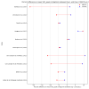
Cardiopulmonary and metabolic responses during a 2-day CPET in [ME/CFS]: translating reduced oxygen consumption [...], Keller et al, 2024

With these 4 included, I found a cohen_d of 0.008 and p_value of 0.93. With them excluded, things change quite dramatically. The effect sizes goes to d =0.44 and the p-value = 0.000151.
That looks like a reasonable difference. Also tried scipy.stats.mannwhitneyu on the full sample and got a p-value of 0.00503.

I'm getting the same cohen d value for with and without the outliers, but different t-test and mann-whitney values.

I highlighted the results for workload absolute difference at AT because it matches the t-test and cohen d values from your first calculations.

With outliers included:
Screenshot from 2024-09-11 08-38-53.png

Outliers removed:
Screenshot from 2024-09-11 08-38-45.png

That's with Jamovi. Same results with Python on the full dataset:
Code:
mecfs_df = df[df['phenotype'] == 'MECFS']
hc_df = df[df['phenotype'] == 'HC']

es = cohend(mecfs_df['AT_wkld_diff_percentage'], hc_df['AT_wkld_diff_percentage'])

U1, mw_p_val = mannwhitneyu(mecfs_df['AT_wkld_diff_percentage'], hc_df['AT_wkld_diff_percentage'])

t_stat, tt_p_val = ttest_ind(mecfs_df['AT_wkld_diff_percentage'], hc_df['AT_wkld_diff_percentage'], equal_var=False)

# MECFS: 84
# HC: 71
Cohen's D: -0.00812
Mann-Whitney p-value: 0.04783
Welch's t-test: 0.95745

With PI-026 removed (but outliers included), the Mann-Whitney p-value goes from 0.048 to 0.044: (note the second metric is different from above)
upload_2024-9-11_8-44-58.png
 
Last edited:
I'm getting the same cohen d value for with and without the outliers, but different t-test and mann-whitney values.
Apologies for the wrong p-values, not sure what went wrong there.

Here's what I got for values at AT and with PI-026 excluded. The first row looks very similar to your results for Work at AT (although for some reason, some figures are a bit different).

upload_2024-9-11_15-51-58.png

One thing that strikes me is that working with scores on the outcome scale or with percentages makes a lot of difference. For the outcome scores the results for a t-test and Mann-Whitney test are relatively the same but when working with percentages, it's an enormous difference.

Recalculating everything to percentages seems to inflate some of the outliers. In the original score difference for Work at AT, this wasn't that big of a problem.

upload_2024-9-11_15-55-47.png

This all makes the analysis quite complex.

Conceptually I think the percentage scores are the most correct. Using the original scales is like giving extra weight to the participants that had a large value on day 1 (as if they matter more) and there is no good reason to do this. Unfortunately, that means that the cohen d is not a reliable effect size and that we probably need to use Mann-Whitney U.

Here's what I got for values at AT EDIT: max and with PI-026 excluded and exclusion of the 10 patients who did not meet the criteria for peak values.

upload_2024-9-11_16-13-43.png

Time and VO2 seems significant but don't make it after multiplicity correction because 20 tests were done (I have removed VO_t because it is basically the same as VO2 and distorts the p-value correction).

upload_2024-9-11_16-24-40.png
 
Last edited:
Here's what I got for values at AT and with PI-026 excluded. The first row looks very similar to your results for Work at AT (although for some reason, some figures are a bit different).

Nice, thanks. Which differences are you talking about? The three stats for both metrics seems to match.

Here's what I got for values at AT and with PI-026 excluded and exclusion of the 10 patients who did not meet the criteria for peak values.

Did you exclude those 10 from AT? Is that necessary? I'm not sure that not hitting peak affects their AT values.

Still not much is significant before corrections. Just wkld, VE_VCO2, and PETCO2.
 
Which differences are you talking about? The three stats for both metrics seems to match.
Small differences like:
Cohen_d_difference: I got: -0.129, you got: 0.12646
P_Welch_Difference: I got:0.424, you got: 0.432
etc.

Did you exclude those 10 from AT? Is that necessary? I'm not sure that not hitting peak affects their AT values.
No sorry, typo, the second overview I posted was for maximum values.

Still not much is significant before corrections. Just wkld, VE_VCO2, and PETCO2.
For the max values VO2 (p=0.005) and Time (p=0.012) also point to an effect that was almost significant after multiplicity correction.

Apologies for the repeated errors. The analysis is more complex than I thought and I have overextended myself a bit trying to understand it all.
 
Small differences like:
Cohen_d_difference: I got: -0.129, you got: 0.12646
P_Welch_Difference: I got:0.424, you got: 0.432
etc.

Oh, you mean for absolute difference? Does your first chart show both absolute and percentage? There are two of each stat in every row. The percentage ones seem to match. For absolute, I think mine match your first chart in a previous post.

Apologies for the repeated errors. The analysis is more complex than I thought and I have overextended myself a bit trying to understand it all.
No worries, I've been focusing a lot on this too as it's pretty fun and my brain's kind of moving slow now.

For the max values VO2 (p=0.005) and Time (p=0.012) also point to an effect that was almost significant after multiplicity correction.

Based on the Mann-Whitney and the plot for AT wkld percentage and fairly consistent previous studies, I'd feel pretty confident saying there's almost definitely some effect between the groups for this metric. Without those outliers, it looks a lot like a clear shift in the whole group down by about 10-15%. Though might be worth checking the matched groups too.

VO2 at AT not being significant is kind of surprising.

I'd like to look into those other effect measurements that can handle outliers I posted about too, not sure how complex that would be.
 
Last edited:
effect measurements that can handle outliers I posted about too, not sure how complex that would be.
If found one that I find quite intuitive: the Common Language Effect Size (CLES). If you were to randomly take a participant from the ME/CFS group and a random participant from the HC group, how often would the ME/CFS patients have a lower value?

If this was random noice and no equal values, then it would be 50/50.

In the case of VO2_max, If found a value of 64%. So if one were to compare a random ME/CFS patients with a random healthy control, the former would have lower values 64% of the time. For Work_AT I found a value of 59%.

upload_2024-9-11_22-48-34.png
 
If found one that I find quite intuitive: the Common Language Effect Size (CLES). If you were to randomly take a participant from the ME/CFS group and a random participant from the HC group, how often would the ME/CFS patients have a lower value?

If this was random noice and no equal values, then it would be 50/50.

In the case of VO2_max, If found a value of 64%. So if one were to compare a random ME/CFS patients with a random healthy control, the former would have lower values 64% of the time. For Work_AT I found a value of 59%.


Very cool. I tried out cliffs delta, which seems to be a popular non-parametric alternative to Cohen's d for effect size. I used all the default arguments in R.

https://en.wikipedia.org/wiki/Effect_size
Cliff's delta or d, originally developed by Norman Cliff for use with ordinal data,[36][dubiousdiscuss] is a measure of how often the values in one distribution are larger than the values in a second distribution. Crucially, it does not require any assumptions about the shape or spread of the two distributions.

d is linearly related to the Mann–Whitney U statistic; however, it captures the direction of the difference in its sign.


https://openpublishing.library.umass.edu/pare/article/1977/galley/1980/view/
Cliff’s δ can be interpreted as the degree of distributional non-overlap between two distributions (Cliff, 1993, 1996). For instance, using the previous example, δ = 0.40 indicates a 40% non-overlap (or 60% overlap) between Time 1 and Time 2.
[...]
It is also common to interpret effect sizes as “negligible”, “small”, “medium”, or “large”. Table 2 shows the benchmarks for interpreting Cohen’s d as suggested by Cohen (1988), as well as the equivalent interpretation for Cliff’s δ (calculated via the bridge). Note that these are only conventional rules of thumb. It is best to interpret effect sizes in light of previous research in the relevant field of investigation wherever possible (Balkin & Lenz, 2021; Ferguson, 2009; Grissom & Kim, 2012).

The function also provides the upper and lower range of the 95% confidence interval of the effect size.

Rule of thumb for interpreting:
Interpretation | Cohen’s d | Cliff’s delta (δ)
Negligible | <0.20 | <0.15
Small | 0.20 | 0.15
Medium | 0.50 | 0.33
Large | 0.80 | 0.47
upload_2024-9-11_19-38-50.png

I wanted to visualize the relative distributions (outliers excluded) in a way that looks a little less disorganized than the swarm plot. Here are density plots and histograms for AT workload and max VO2:

AT workload percentage difference
AT_wkld_diff_percentage_histogram.png AT_wkld_diff_percentage_kde.png

max VO2 percentage difference
max_VO2_diff_percentage_histogram.png max_VO2_diff_percentage_kde.png

Easier to see the leftward "shift" when it's a thumbnail, than zoomed in with all the spikes, I think.
 
Last edited:
So just to clarify what you two are finding: there is a small difference between mecfs and healthy on a 2 day cpet ? Is that the top line?
 
So just to clarify what you two are finding: there is a small difference between mecfs and healthy on a 2 day cpet ? Is that the top line?

Edit: I decided I don't feel comfortable making any conclusions about this without more experience in statistics. I'm happy playing with the data to see if anything interesting stands out, but I can't say anything definitive.
 
Last edited:
I tried out cliffs delta, which seems to be a popular non-parametric alternative to Cohen's d for effect size.
It's similar to CLES I believe. While CLES is the number of wins (groupA > Group B) divided by the total number of possible comparisons, cliff d seems like the (wins - loses) divided by the total number of possible comparisons. I get the same values as you using this formula.

I think that visually it means how much one distribution sticks out of the other one.
 
One other thing that I've been looking it is Winsorizing the data, meaning cutting of the data at a certain percentile and replacing the values outside the limit with the percentile at both sides of the data.
Winsorizing - Wikipedia

I tried different cutoffs at 1%, 2.5% and 5%. For the VO_max data I think the 1% cutoff is most appropriate as it seems to deal with the most extreme outliers. Higher percentiles distort the data.

upload_2024-9-12_16-54-27.png
upload_2024-9-12_16-54-38.png
upload_2024-9-12_16-54-43.png

For workload_AT 1% wasn't sufficient, I think 2.5% works better. But even at this point, the effect size is really small.

upload_2024-9-12_16-56-9.png
upload_2024-9-12_16-56-45.png
upload_2024-9-12_16-56-51.png

I also checked and while there is a small effect for Workload_AT for the full cohort, it isn't there for the matched pairs (p Mann Whitney = 0.346, CLES = 0.55, cohen_d stays lower than 0.2 even after windsorizing 10%).

upload_2024-9-12_17-1-12.png

The results for VO2_max are very similar in the matched pairs, so I think that is pretty much the only consistent effect visible in the data.
 
So just to clarify what you two are finding: there is a small difference between mecfs and healthy on a 2 day cpet ? Is that the top line?
There seems to be a moderate effect size for VO2 at peak values (not VO2 at the anaerobic threshold) with ME/CFS patients having lower values than controls, 63% of the time.

The associated p-value is 0.005 but the authors tested more than 20 outcomes, at both the maximal and the anaerobic threshold, and in the matched and full cohort. So after controlling for multiple tests, this difference is not statistically significant and could have happened just by chance.

None of the other values seem to show a notable difference, although there is a consistent trend that ME/CFS patients have lower values. One could perhaps argue that is no coincidence that VO2peak shows up with the highest effect size as this has been highlighted in previous studies but a recent meta-analysis showed that VO2peak had a small effect that was not significant.

It's workload at the anaerobic threshold that has been consistently reported to be reduced in ME/CFS patients but that was not found in this study. For the full cohort there is perhaps a small effect, but this is not seen in the matched pairs cohort.
 
I was having a hard time finding a detailed explanation of how all the metrics in a CPET are determined. I'm too tired to read dense papers on protocol, so my understanding could be wrong for some or all of this.

For VO2 at max, what exactly is that? Is that the instantaneous oxygen consumption rate at the moment one attains at least two of those max criteria? That would seem a bit more objective, but my impression is that it is the highest VO2 achieved, period. So even if both groups achieve max criteria, if one group feels a bit more motivated for whatever reason, they push a little harder and get a higher VO2. If my understanding is right, this feels more like a psychological measure than physiological. Same for all metrics at peak if that's how it is measured.

I'm more interested in anaerobic threshold since it seems like a fairly direct measure of the body's ability to efficiently do work.

With that too, I'm confused about how workrate at AT is measured. Is it instantaneous at the moment of AT? If so, it seems that could introduce a fair bit of randomness. For example, if someone's workrate is constant and just by chance they significantly slow down one second before AT, it probably won't be enough time to delay AT, so the workrate will seem lower than reality. Same if someone's workrate is very volatile. It just depends what point on the ups and downs of workrate you happen to measure.

VO2 seems like it'd be more smoothed out even if the participant was changing speed a lot since it'd be delayed from changes in speed, unlike work, and would probably have less variability.

This seems to align with the data, where -50 to 50% changes in workrate at AT are commonly seen, while VO2 is only commonly seen within -20 to 20% change.

I wonder if it would make more sense to calculate work maybe over five seconds up to the point of AT, which would reduce randomness.

Also, from what I understand, with a bike CPET, the participant can't be forced to maintain a constant workrate. The paper says "the prescribed pedal rate of 50–80 rpm", so that introduces more variability. If some participants have different rates, I think that could significantly change what metrics at AT look like.

A treadmill CPET seems much more controlled. You can set an exact workrate by setting a speed and the participant has to maintain that exact speed or fall off the back.

A more robust peak metric seems like it'd be useful too.
 
Last edited:
We haven't posted or discussed this yet, but I think most statisticians would use a mixed linear effects model for this. That way they can account for the repeated measures (day1-day2) of participants but still test for differences between group.

I've tried this using the following model:
model = Lmer('VO2 ~ phenotype * Study_Visit + (1 | ParticipantID)', data=df_max)

upload_2024-9-12_21-50-34.png
The last line, the interaction, is what interest us and the results are the same that we got by calculating the differences per participant and then comparing patients and controls: -0.93 mean difference and p = 0.03. This doesn't account for outliers though.
 
We haven't posted or discussed this yet, but I think most statisticians would use a mixed linear effects model for this. That way they can account for the repeated measures (day1-day2) of participants but still test for differences between group.

I've tried this using the following model:
model = Lmer('VO2 ~ phenotype * Study_Visit + (1 | ParticipantID)', data=df_max)

View attachment 23282
The last line, the interaction, is what interest us and the results are the same that we got by calculating the differences per participant and then comparing patients and controls: -0.93 mean difference and p = 0.03. This doesn't account for outliers though.

That's interesting, but getting a bit out of my depth and brain bandwidth to really grasp at this point. Looks like the p-value isn't super low, and we've tested about a million things already, so with correction not amazing, I think.
 
I made a couple little charts of all 2-day CPET studies with controls from MEpedia showing percent difference between means of the days for each group for VO2peak and workload at AT.

Notes:
  • Lien 2019 not included because no numbers are given, I only see graphs of points.
  • Nelson 2019, Davenport 2020, and Keller 2024 used sedentary controls.
  • Both van Campen studies used idiopathic chronic fatigue controls.
  • All participants used cycle ergometer, except for 2 out of 6 ME/CFS and 0 out of 6 controls in VanNess 2007 used Bruce treadmill protocol.
  • Keller et al (VO2peak matched), 2024 is a subset of participants from Keller et al, 2024.
VO2_peak (ml_kg_min)_dumbbell.png
wkld_AT (W)_dumbbell.png
 
Last edited:
A 2020 meta-analysis tried to estimate the effect sizes. I think it is flawed because it focuses on the mean changes but it still shows that the largest differences were found not at peak values but at AT, especially for Workload (WR). The data by Keller et al. does not really support this as VO2peak rather than WR_AT showed the largest effect sizes.

View attachment 23221

View attachment 23222
View attachment 23223

I think there might be an error here. For Nelson, it shows ME decreased by 0.11 and CTL decreased by 0.38. But the study shows ME increased by 0.1 and CTL increased by 0.4. I'm guessing they requested the data from the authors to get more decimals, but the signs are switched. I checked one other metric from VanNess 2007 and that seems consistent with the meta analysis.
 
Last edited:
I made a couple little charts of all 2-day CPET studies
Nice visualization, thanks. One suggestion: it might more intuitive if both graphs have the same scale, so that difference in VO2 and wkld can be compared. Now they look the same size but VO2 has a scale from -20 to 10 and wkld from -50 to 20.
 
Last edited:
I think the Nelson 2019 study is interesting. Even though it is quite small, it is one of the few that used an appropriate analysis comparing both the testing difference (CPET2-CPET1) and group difference (MECFS versus HC) at the same time. They also suggest using percentages:
given the large variation in WR at VT for ME/ CFS patients (ranging from 50 to 140 W in the current study), it is likely more appropriate to use the percentage, rather than absolute change in VT
They only difference they found was for workload at the AT which went from 87.8 to 72.5, a percentage difference of the mean of -17.43%.

They also did a ROC analysis with an optimal threshold of −9.8% (sensitivity=68.8%, specificity=100%). In other words none of the HC controls had a decrease of 10% or more, while 2/3ds of the ME/CFS patients did and they suggested that this might become a biomarker.
Yet in the data by Keller et al., almost 40% of controls had a percentage decline of -9.8% or greater for work at the anaerobic threshold while only 53% of ME/CFS patients did.

I tried to do an ROC analysis for the Keller data to find the optimal threshold and got these results. A decline of -14.89% best separated the groups. Approximately 70% of HC are above this threshold, 30% under it. 50% of MECFS are above, and 50% under.


upload_2024-9-14_10-20-22.png


upload_2024-9-14_10-20-27.png
 
Back
Top Bottom