Multi-omics identifies lipid accumulation in Myalgic Encephalomyelitis/Chronic Fatigue Syndrome cell lines: a case-control study, 2026, Missailidis et

@jnmaciuch so a "coherent biological story" is the conversation about B Cells and lipids ? So maybe we are looking at a Single Point Of Failure (SPOF) in ME/CFS am I correct (so we do not care about ER Stress, impaired N-glycans, LXR downregulation, etc etc) ? If this is what you are implying and you believe at a SPOF being at play I have no further comments.
I’m sorry I don’t quite know what you mean. [Edit: I don’t think any chronic disease model is talking about a “single point of failure” except genetic disorders and that’s not what I’ve been discussing?] Maybe best to leave the conversation where it’s at to avoid derailing the thread.
 
Last edited:
I have a question about the treatment of missing values. At line 356 it is mentioned that missing values were replaced with the feature mean and that features with more than 50% of values missing were excluded. 50% of missing values is quite a high bar for exclusion (not a criticism, just an observation). Figure 3A of the lipid PC(O:38-4) is compelling, even exciting, but I'm wondering how many of the ME/CFS fold change values there are the result of an absolute value imputed due to missingness?
I don’t want to speak over Daniel but from the methods it seems like imputation was only used for the specific step of pathway analysis using MetaboAnalyst—individual feature comparisons would not use imputation.

It’s possible for imputation to skew enrichment of some pathways if controls had a much different proportion of imputed values than cases. The way you check for that is doing univariate tests for some of the top features driving your pathway of interest, which they [edit: showed in the main text] for at least a few features (I haven’t checked the supplementals)

That slight difference in cholesterol sulphate that does not survive adjustment for multiple comparisons is the sole driver of the MetaboAnalyst Pathway analysis (line 432) result of 'possible effects on steroid hormone biosynthesis'. Line 439 notes that in each of the 'dysregulated pathways' 'there was one metabolite that the dysregulation was attributable to'. Given all the uncertainties, it seems a very long bow to draw to suggest the slight increase in the mean cholesterol sulphate result is evidence of disease-relevant 'possible effects on steroid hormones biosynthesis'.
I think that part of the text refers to the joint pathway analysis--meaning that those 3 pathways had one lipid feature each, but the enrichment was also driven by features in other assays that are known to be part of the same pathway.
 
Last edited:
I think that part of the text refers to the joint pathway analysis--meaning that those 3 pathways had one lipid feature each, but the enrichment was also driven by features in other assays that are known to be part of the same pathway.
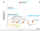
Here's Figure 1A. The caption and the text are quite clear that the things driving the selection of the three 'potentially dysregulated pathways' are each of the three features (ie one feature driving one pathway). The Steroid hormones biosynthesis datapoint is barely significant (I think that's before adjustment for multiple comparisons) and it rates approximately 0 on the x axis, which the caption suggests is a measure of pathway importance, which considers pathway enrichment.


"Figure 1: Potentially dysregulated metabolic pathways in ME/CFS LCLs are attributable to the levels of pyridoxal, thiamine, and cholesterol sulphate. (A) MetaboAnalyst Pathway Analysis of the recognised subset of the polar metabolome shows three significantly dysregulated pathways shown above the blue threshold line: vitamin B6 metabolism, thiamine metabolism, and steroid hormone biosynthesis. The Y-axis indicates significance, and the X-axis represents pathway importance, integrating pathway enrichment with degree centrality (see Methods)."

Screenshot 2026-01-14 at 11.29.39 AM.png

It's looking a little like a shoe-horning of the data to fit with recent claims elsewhere, especially given the relevance of the age differences between the cohorts of cell donors to that particular feature.
 
Last edited:
Here's Figure 1A. The caption and the text are quite clear that the things driving the selection of the three 'potentially dysregulated pathways' are the three features. The Steroid hormones biosynthesis is barely significant (I think before adjustment for multiple comparisons) and it rates approximately 0 on the x axis, which the caption suggests is a measure of pathway importance, which considers pathway enrichment.


"Figure 1: Potentially dysregulated metabolic pathways in ME/CFS LCLs are attributable to the levels of pyridoxal, thiamine, and cholesterol sulphate. (A) MetaboAnalyst Pathway Analysis of the recognised subset of the polar metabolome shows three significantly dysregulated pathways shown above the blue threshold line: vitamin B6 metabolism, thiamine metabolism, and steroid hormone biosynthesis. The Y-axis indicates significance, and the X-axis represents pathway importance, integrating pathway enrichment with degree centrality (see Methods)."

View attachment 30115

It's looking a little like a shoe-horning of the data to fit with recent claims elsewhere, especially given the issue with the age differences between the cohorts of cell donors.
Ah my bad! I thought that was the paragraph talking about Fig 2 not Fig 1 (since the bar plot showed some pathways having 1 lipid hit). I agree that having one upregulated metabolite doesn’t mean there’s evidence for enrichment of the whole pathway—I appreciate the text was upfront about there being only one metabolite at least.

As to your point about the possible influence of age—the finding that seems least likely to be influenced by that is the most striking finding in Fig 4. If anything, you’d expect less mobilization of lipids in B cells with age given the known decline of eg antibody protection from vaccines with age (and the increase in high cholesterol with age would be much more a function of changes in liver cells than B cells).

But the effect of age could be quickly checked just by doing a univariate association between age and total or average lipid content. Ideally you’d want to do a linear model with both age and disease status as covariates to fully rule it out but unfortunately there are too few participants for that.
 
It's looking a little like a shoe-horning of the data to fit with recent claims elsewhere, especially given the relevance of the age differences between the cohorts of cell donors to that particular feature.
I've just gotten back to the office so I haven't read the whole thread yet but just saw this comment (edit: I am editing in more responses as i see them). I'm not sure why it's raising a red flag for shoehorning so I'll explain what I did. I put the features into metaboanalyst and those three pathways came up as significantly affected. I reported what it determined just as it was described in MetaboAnalyst. I didn't manipulate or choose anything different.. it's an unbiased output of the software. The blue significance line wasn't drawn arbitrarily, it's the threshold that the software reported to me. I didn't linger on it and moved on to other results because I didn't think it was a clearly important result either (the polar pathway analysis that is, as we say it is based on individual metabolites which were not hugely different). I very intentionally chose not to belabour it further at that stage of the results section. I included everything that my analysis pipeline included for the sake of thoroughness and transparency even if particular results are or aren't convincing, and distributed my focus accordingly. I included a mountain of supplemental data for the sake of this completeness and transparency as well. I think my language was also pretty transparent in that it this little part of the analysis was an exercise included for thoroughness, just in case.

Regarding the age thing, I did look for relationships between age and total lipid and didn't see evidence of an effect. From memory I also did it for the altered features reported in the paper and didn't detect any relationships either.

Believe me, my approach in this paper was "put the data through unbiased tools and stats and then report the outcome neutrally with relevant context but minimum of interpretation" - I really didn't try to game or push anything in particular and I hope (and believe) that this is apparent in the text. I actually had a disagreement with a reviewer in a prior submission to another journal that was rejected... they wanted more of a "story" and claimed the data read too much like a neutral report of the observations. That was my intention and I didn't budge on it even to my own disadvantage in that instance. The intention was to, in the Results: have all of the data included and left to speak for itself, with some context but minimum of interpretation, and in the Discussion: then focus on interpretation and put forward the most compelling avenues for future work in the Conclusions. (hence why the polar pathway analysis outputs are not mentioned in specific terms in the Abstract or Conclusions). Hope this makes sense.
Missing values
I have a question about the treatment of missing values. At line 356 it is mentioned that missing values were replaced with the feature mean and that features with more than 50% of values missing were excluded. 50% of missing values is quite a high bar for exclusion (not a criticism, just an observation). Figure 3A of the lipid PC(O:38-4) is compelling, even exciting, but I'm wondering how many of the ME/CFS fold change values there are the result of an absolute value imputed due to missingness?
This is only for the metaboanalyst polar metabolite pathway analysis, the individual features I am showing in the paper and analysing elsewhere are all real data, no imputation. All of the scatter plots are real data. Most if not all of the lipids would have signal for every sample so there was no need to deal with missing values for those analyses. I tried very hard to present everything as transparently and readably as possible, hence the scatter plots with minimum stats graphics so as to let the points speak for themselves.

That slight difference in cholesterol sulphate that does not survive adjustment for multiple comparisons is the sole driver of the MetaboAnalyst Pathway analysis (line 432) result of 'possible effects on steroid hormone biosynthesis'. Line 439 notes that in each of the 'dysregulated pathways' 'there was one metabolite that the dysregulation was attributable to'. Given all the uncertainties, it seems a very long bow to draw to suggest the slight increase in the mean cholesterol sulphate result is evidence of disease-relevant 'possible effects on steroid hormones biosynthesis'.
This is all why I intentionally used softer (but I think transparent) language to summarise the MetaboAnalyst output and in specific terms the rationale for its inclusion, and then move on to the more interesting results which received more focus and emphasis, especially at the Abstract and Conclusions which is where people are going to go looking for the important bits. As I say, it is there for completeness, transparency, and just in case it is a piece of the puzzle. The focus is firmly on the more clear results.
 
Last edited:
Thanks @DMissa.
To be clear, I'm impressed with lots of things about this paper so far and I very much appreciate the transparency and readability of the paper and you being here to discuss it. I'm not suggesting you have aimed to misrepresent data, I know you wouldn't do that. I chose the wrong word in 'shoehorning'.

But, when I look at the 1B chart and then read that it is evidence of a possible steroid hormone biosynthesis dysregulation in ME/CFS, it doesn't seem quite right. So, I'm trying to understand.
Edit - There was a decision to undertake and present the pathway analysis on the polar metabolites despite not identifying any polar metabolite dysregulation, so there was a choice made there.
We decided to proceed with a subsequent pathway analysis of the polar metabolite data using a feature inclusion threshold of p < 0.05 as only a brief indicative exercise to ensure that any potential processes of note weren’t overlooked as possible false negatives

Missing values
This is only for the metaboanalyst polar metabolite pathway analysis, the individual features I am showing in the paper and analysing elsewhere are all real data, no imputation.
So, Figure 1B is just the actual values, and any imputed values aren't shown? How many missing values were imputed for the three polar metabolites in the Metaboanalyst metabolite pathway analysis?

Is it possible that the inclusion of imputed values affected the p values for the pathways? For example, if, as is possible under that rule of allowing up to 50% imputed values, a metabolite had a large number of missing values, and mean values were used to replace the missing values, wouldn't that improve the p values? The extra data clustering at each of the group means would surely make the groups look more different.

That's great that the lipid PC(O:38-4) chart consists only of actual values, no imputed values. I'm really looking forward to getting to the discussion about that and I hope you can get support for replication.


Steroid hormone biosynthesis
432 MetaboAnalyst Pathway analysis suggests possible effects on vitamin B6 metabolism, thiamine metabolism and steroid hormone biosynthesis
I'm glad the suggestion of a dysregulated steroid hormone biosynthesis didn't make it into the discussion or the abstract, but I'm still a bit concerned that that sentence in the Results (edit - it's actually a title in the paper) overstates the situation. The paper says
418 No polar metabolites satisfied the threshold for significance (FDR < 0.05) in ME/CFS LCLs using the Benjamini-Hochberg procedure for multiple comparison correction (23).
In any case, we identified no clear polar metabolite dysregulation in these LCLs

So, the possibility of a pathway being dysregulated seems to be based on only one polar metabolite that is actually not in itself significantly different, that isn't itself dysregulated. I get that if there were 4 metabolites that weren't themselves quite significant enough, but that were all in the same pathway, a valid case could be made for the pathway being dysregulated. But, when it is written that only one metabolite is driving the identification of a pathway, and that one metabolite is not significantly different between the ME/CFS cells and the controls, the lack of difference seems to be a problem.

The chart shows that the ME/CFS levels of cholesterol sulphate fit entirely within the range of the healthy controls - there are healthy control cells with both more and with less cholesterol sulphate than the ME/CFS cells. So yes, many things are technically possible, but it surely is extremely unlikely on the basis of that chart that that metabolite is the driver of a steroid hormone biosynthesis dysfunction in ME/CFS?

Figure 1B
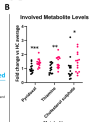
Screenshot 2026-01-14 at 5.26.03 AM.png


Was there an adjustment for multiple comparisons in the MetaboAnalyst Pathway analysis?


Age
Regarding the age thing, I did look for relationships between age and total lipid and didn't see evidence of an effect. From memory I also did it for the altered features reported in the paper and didn't detect any relationships either.
It would be great if you could check the relationship between the actual values and age for LCL cholesterol sulphate levels.
 
Last edited:
Lipidome analysis
There were 454 lipids detected. The dataset was adjusted for multiple comparisons. Only one lipid was found to be significantly reduced in the ME/CFS samples compared to the controls, that's the PC(O-38:4).

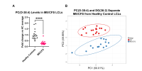
This is Figure 3. Figure 3A shows the remarkable separation of the groups on PC(O-38:4)
Screenshot 2026-01-15 at 6.07.32 AM.png

Figure 3: A) PC(O-38:4) was the most significantly altered lipid in ME/CFS LCLs after correcting for multiple comparisons via Benjamini-Hochberg method (p =3.823 ×10⁻⁶, Mann-Whitney U-test). Data expressed as fold change relative to HC average abundance. B) PCA plot developed using PC(O-38:4) and DG(36:2) levels separates ME/CFS and HC LCLs perfectly. Original values are ln(x)-transformed. Unit variance scaling is applied to rows; SVD with imputation is used to calculate principal components. X and Y axis show principal component 1 and principal component 2 that explain 50.1% and 49.9% of the total variance, respectively. Prediction ellipses are such that with probability 0.95, a new observation from the same group will fall inside the ellipse.

526 Indeed, PC(O-38:4) levels combined with DG(36:2) levels (the most elevated lipid), showed clear clustering of ME/CFS and HC LCLs in PCA (Figure 3B), as might be expected given their preselection as highly altered features.

I don't understand why the PCA (Figure 3B) is there. The point of a PCA is to compress information from a whole lot of features into just two (shown on the x and y axes), If you are only going to use two features, you might as well just plot them against each other and be clear about what you are doing. Basically what that PCA is saying is that 'if we take only two of the lipids that are the most different between the ME/CFS and control groups, just two out of 454, then the PCA shows a separation. Well, yes.

I could take a large random data set for two groups, select the two most different features and plot them and always show a difference. To say that the two lipids account for 100% of the variability means very little when only two lipids are included in the PCA. @DMissa, you seem to be aware of the problem, with that note 'as might be expected given their preselection as highly altered features'. So, why is it useful?

To me, having that PCA there weakens the paper, it reduces credibility, and that's a shame with that really interesting result in Figure 3A. I would far rather have a plot of the lipid that was found to be most increased in the ME/CFS cells compared to the control cells (DG(36:2)) in the place of the PCA. Or plots for the 5 most different lipids.
 
There was a decision to undertake and present the pathway analysis on the polar metabolites despite not identifying any polar metabolite dysregulation, so there was a choice made there.
The choice was made prior to obtaining any data, I decided to be thorough and include the whole pipeline so as not to keep any results from the community. That includes negative results.
So, Figure 1B is just the actual values, and any imputed values aren't shown? How many missing values were imputed for the three polar metabolites in the Metaboanalyst metabolite pathway analysis
Correct, and none.
So, the possibility of a pathway being dysregulated seems to be based on only one polar metabolite that is actually not in itself significantly different, that isn't itself dysregulated.
It is based on the levels of that metabolite within context of levels of each metabolite in the whole metabolome, which is a different question to its levels in isolation.
The chart shows that the ME/CFS levels of cholesterol sulphate fit entirely within the range of the healthy controls - there are healthy control cells with both more and with less cholesterol sulphate than the ME/CFS cells. So yes, many things are technically possible, but it surely is extremely unlikely on the basis of that chart that that metabolite is the driver of a steroid hormone biosynthesis dysfunction in ME/CFS?
See prior comment
It would be great if you could check the relationship between the actual values and age for LCL cholesterol sulphate levels.
What I'm saying in the prior post is that I have done this, specifically.

To be clear, I'm impressed with lots of things about this paper so far and I very much appreciate the transparency and readability of the paper and you being here to discuss it. I'm not suggesting you have aimed to misrepresent data, I know you wouldn't do that. I chose the wrong word in 'shoehorning'.
All good, please don't mistake my tone as terse, I'm just time poor atm so writing with brevity.
I don't understand why the PCA (Figure 3B) is there. The point of a PCA is to compress information from a whole lot of features into just two (shown on the x and y axes), If you are only going to use two features, you might as well just plot them against each other and be clear about what you are doing. Basically what that PCA is saying is that 'if we take only two of the lipids that are the most different between the ME/CFS and control groups, just two out of 454, then the PCA shows a separation. Well, yes.

I could take a large random data set for two groups, select the two most different features and plot them and always show a difference. To say that the two lipids account for 100% of the variability means very little when only two lipids are included in the PCA. @DMissa, you seem to be aware of the problem, with that note 'as might be expected given their preselection as highly altered features'. So, why is it useful?

To me, having that PCA there weakens the paper, it reduces credibility, and that's a shame with that really interesting result in Figure 3A. I would far rather have a plot of the lipid that was found to be most increased in the ME/CFS cells compared to the control cells (DG(36:2)) in the place of the PCA. Or plots for the 5 most different lipids.
Yeah I'd seen what occurred with the Tate paper so I took this question to an accredited statistician we've worked with on other papers where PCA was used to test whether two features were able to produce clusters between clinical groups and they said that it's a valid application of PCA. In any case, the separation is clear from the scatter so I don't think anything is being misrepresented. Maybe scatter of the other lipid could have been better.. I'll take it on board for future analyses.
Was there an adjustment for multiple comparisons in the MetaboAnalyst Pathway analysis?
Yep, it's built in to the tool.

As I say, this early step in the analysis was included for completeness and I don't think I confidently stated anything to be happening that didn't have clear evidence behind it. I tried to be pretty deliberate with the language.
 
Was there an adjustment for multiple comparisons in the MetaboAnalyst Pathway analysis?
Yep, it's built in to the tool.
Were the adjusted p-values used in the paper? I see that there are FDR values in table S2 for the pathways, in which only vitamin B6 metabolism is below .05. But the text and figure 1A seem to be based on the raw p-values.
 
Were the adjusted p-values used in the paper? I see that there are FDR values in table S2 for the pathways, in which only vitamin B6 metabolism is below .05. But the text and figure 1A seem to be based on the raw p-values.
-Log10(p-value) is the standard choice for plotting things like enrichment of a bunch of pathways or a volcano plot, since FDR correction will leave you with a lot of redundant values. It's recommended to just use an additional visual indicator for which ones passed FDR or mention in the text/legend. I assume it wasn't mentioned here largely because it becomes a moot point anyways after explicitly stating that each finding was attributable only to one feature
 
PCA
Yeah I'd seen what occurred with the Tate paper so I took this question to an accredited statistician we've worked with on other papers where PCA was used to test whether two features were able to produce clusters between clinical groups and they said that it's a valid application of PCA. In any case, the separation is clear from the scatter so I don't think anything is being misrepresented. Maybe scatter of the other lipid could have been better.. I'll take it on board for future analyses.
Honestly, I'm a bit flabbergasted. After going to all that effort to highlight the problem with the use of a PCA in the Tate paper, one of my favourite ME/CFS scientists is aware of that and still commits even worse PCA abuse.... I don't understand why you would choose to do a PCA in this way.

I've checked a number of guides on the use of PCA and none recommend it for use in this situation of only two highly selected features, when interpretability of the features is what is needed. I don't think that any statistician would disagree.

The figure caption says 'PCA plot developed using PC(O-38:4) and DG(36:2) levels separates ME/CFS and HC LCLs perfectly.' But, I could take an entirely random dataset of 454 features, choose the two most differentiating independent features and produce a PCA that looks much like the one you have there. It's essentially extreme cherrypicking, ignoring the multiple comparisons it took to find those two differentiating features.

The fact that the two most differentiating features out of 454 features can separate the two groups is not at all remarkable. What is truly interesting here are the identities of the particular features that are separating the ME/CFS cells from the controls. We want to start thinking about why those particular features and not other ones? Could they tell us something useful about ME/CFS rather than just be a random result?

So, if you want to plot them against each other, please show their names on the chart, don't bury their identities under the PC1 and PC2 labels and confuse people about what has been found.

I'll take it on board for future analyses.
Hopefully it's not too late to fix it in this paper? Yes, a scatter plot of one or more of the most differentiating lipids would be so much better.
 
Were the adjusted p-values used in the paper? I see that there are FDR values in table S2 for the pathways, in which only vitamin B6 metabolism is below .05. But the text and figure 1A seem to be based on the raw p-values.
-Log10(p-value) is the standard choice for plotting things like enrichment of a bunch of pathways or a volcano plot, since FDR correction will leave you with a lot of redundant values. It's recommended to just use an additional visual indicator for which ones passed FDR or mention in the text/legend. I assume it wasn't mentioned here largely because it becomes a moot point anyways after explicitly stating that each finding was attributable only to one feature
That makes sense.

The problem is that there is a blue line and big blue text on Figure 1A indicating that three pathways are significantly affected.

Screenshot 2026-01-14 at 11.29.39 AM.png

Here are the p values and FDR from S2:
Screenshot 2026-01-15 at 8.38.23 PM.png

After correction for multiple comparisons, the p value for steroid hormone biosynthesis is 0.551, nowhere near significant. The line on the chart saying 'Significantly affected' is misleading. FDR is done for a reason.

The caption on Figure 1A adds further confusion:
454 MetaboAnalyst Pathway Analysis of the recognised subset of the polar metabolome shows three significantly dysregulated pathways shown above the blue threshold line: vitamin B6 metabolism, thiamine metabolism, and steroid hormone biosynthesis.
It looks as though there are 87 features that could have potentially contributed to a Steroid hormone biosynthesis and yet there is only one hit, only one feature that is suggestive of pathway dysregulation - and the pathway isn't significant after correction for multiple comparisons. It has an impact of zero.

I think it is important that this is fixed.
 
Nice work! @DMissa It looks like a nice study!

As has been pointed out I think the biggest limitation is the lack of accounting for BMI. I know they've been passaged many times but they seem to be remembering something through all those passages, maybe some kind of insulin resistance phenotype could survive that epigenetically? We saw in our sheffield cohort that the ME cohort did also have a higher BMI so a potential confounder there seems possible. It's a cool finding and like you say it now needs replication in a nicely defined cohort.

Changes in levels of triglycerides and phosphatidylcholines are probably the most well replicated metabolomic findings I think from blood so maybe there's something to that.
 
Last edited:
PCA

Honestly, I'm a bit flabbergasted. After going to all that effort to highlight the problem with the use of a PCA in the Tate paper, one of my favourite ME/CFS scientists is aware of that and still commits even worse PCA abuse.... I don't understand why you would choose to do a PCA in this way.

I've checked a number of guides on the use of PCA and none recommend it for use in this situation of only two highly selected features, when interpretability of the features is what is needed. I don't think that any statistician would disagree.

The figure caption says 'PCA plot developed using PC(O-38:4) and DG(36:2) levels separates ME/CFS and HC LCLs perfectly.' But, I could take an entirely random dataset of 454 features, choose the two most differentiating independent features and produce a PCA that looks much like the one you have there. It's essentially extreme cherrypicking, ignoring the multiple comparisons it took to find those two differentiating features.

The fact that the two most differentiating features out of 454 features can separate the two groups is not at all remarkable. What is truly interesting here are the identities of the particular features that are separating the ME/CFS cells from the controls. We want to start thinking about why those particular features and not other ones? Could they tell us something useful about ME/CFS rather than just be a random result?

So, if you want to plot them against each other, please show their names on the chart, don't bury their identities under the PC1 and PC2 labels and confuse people about what has been found.


Hopefully it's not too late to fix it in this paper? Yes, a scatter plot of one or more of the most differentiating lipids would be so much better.

This is harsh. Doing a 2D scatterplot of the two features after normalisation should look pretty much exactly the same as the PCA that's currently there (the entire figure might be rotated slightly but the relative positions of the datapoints should be identical). It's not misleading, it's just unnecessary when a 2D scatterplot is sufficient and clearer.
 
This is harsh. Doing a 2D scatterplot of the two features after normalisation should look pretty much exactly the same as the PCA that's currently there (the entire figure might be rotated slightly but the relative positions of the datapoints should be identical). It's not misleading, it's just unnecessary when a 2D scatterplot is sufficient and clearer.
I really don't want to be harsh and I agree a scatter plot would look similar. But the purposes of the two analyses are completely different and the axes labels make all the difference.

With a scatter plot, it is clear that you have selected one or two features to plot. You might have selected some of the 5% of features that we might expect to be significant at random rather than a biologically based differentiating feature, but the focus is on the identity of the features so that's ok. It is clear what has been done.

In a PCA, you are saying 'look!, we can explain x percent of the variation'. For that to be meaningful, the variation can't be manufactured by the feature selection. Suggesting that 50% of some highly selected variation is explained by a PC axis doesn't really mean anything in this case.

However, a lot of people will look at the PCA and go 'gosh, the data splits the ME/CFS and healthy cohorts so cleanly! Look at those very neat ovals with nearly all the dots inside the lines!'. And indeed, the text somewhat encourages that. They won't register that a PCA like the one shown could be made from a random data set, simply by choosing the two features out of 454 features that differentiate the groups the most.

if we accept PCA presentations like that, it means that components of any large dataset, even of features that are completely irrelevant to a disease, can be presented as meaningfully separating the disease from healthy controls.
 
Last edited:
Honestly, I'm a bit flabbergasted. After going to all that effort to highlight the problem with the use of a PCA in the Tate paper, one of my favourite ME/CFS scientists is aware of that and still commits even worse PCA abuse.... I don't understand why you would choose to do a PCA in this way.

I've checked a number of guides on the use of PCA and none recommend it for use in this situation of only two highly selected features, when interpretability of the features is what is needed. I don't think that any statistician would disagree.

The figure caption says 'PCA plot developed using PC(O-38:4) and DG(36:2) levels separates ME/CFS and HC LCLs perfectly.' But, I could take an entirely random dataset of 454 features, choose the two most differentiating independent features and produce a PCA that looks much like the one you have there. It's essentially extreme cherrypicking, ignoring the multiple comparisons it took to find those two differentiating features.
I'm not sure I agree, the context of PCA usage is really different here and in the Tate paper. For an epigenetic screen, the purpose of showing a PCA as the first step of your analysis is to determine whether your variable of interest represents a strong axis of variation in your data (i.e. one that emerges from an unbiased dimension reduction). So it is more misleading in that paper because what's being shown is at odds with the expected purpose of that figure.

But another way that PCA could be used is to aid visual confirmation of a feature selection process, which is how it is being used here. That's actually where I disagree with this statement:
The fact that the two most differentiating features out of 454 features can separate the two groups is not at all remarkable.
I've done quite a few -omics analyses and I actually don't expect that the top two differential features would cleanly separate your groups of interest. Often what you find is that participants who are on the extreme end for feature #1 end up with middling values in features 2, 3 etc. So after you do univariate associations, it's common for analyses to do something like lasso regression to find the minimum number of features necessary to separate out your groups of interest (which I would expect to be somewhere in the range of 10-100 features from prior experience). Then you would take those top features, run a PCA, and do clustering on the PC values to confirm visually that your subset of top features separate your groups (PCA not only provides dimension reduction but also ends up reducing the effect of different ranges between features to allow for more representative clustering). When you have a small number of features you might just do those steps manually and see how many features it takes to get separation.

If I did this analysis and ended up with only 2 features from my feature selection, I might opt to skip the PCA for the visual representation [edit: and just plot the values for those two features, perhaps with scaling if needed]. So going ahead with the PCA for 2 features is a different choice than what I would have done here, but I would not say that anything is being manipulated and cherry picked. I felt quite clear about what information was being presented and the purpose behind it for that part of the paper.

[edited to remove a superfluous detail about clustering]
 
Last edited:
The problem is that there is a blue line and big blue text on Figure 1A indicating that three pathways are significantly affected.
Yes, most plots like this will include that because you need a way to show where -log10(0.05) is. I agree that perhaps to someone briefly skimming the figures from the paper, this might have the unintentional effect of making it seem like those particular findings are stronger than they are. But like I mentioned above, the clear indication in the text, legend, and even superimposed onto the figure itself that each finding was driven by one metabolite only was more than enough to make me realize that this is essentially a presentation of null results.

I definitely understand being vigilant towards scientists making their results seem more important than they are (intentionally or unintentionally) but I really don’t think this paper is an example of any spin doctoring.
 
Last edited:
I've done quite a few -omics analyses and I actually don't expect that the top two differential features would cleanly separate your groups of interest. Often what you find is that participants who are on the extreme end for feature #1 end up with middling values in features 2, 3 etc......
....I felt quite clear about what information was being presented and the purpose behind it for that part of the paper.
Actually, I'm not really sure why the DG(36:2) feature was chosen for the PCA. The text says that it is the most elevated lipid. Looking at Table S5, DG(36:2) has a Q value (adjusted p) of 0.4 (not significant) and even its unadjusted p value is only 0.03. Fold change, which is a measure of difference relative to the control cell levels was 1.28. There are plenty of other lipids in that table with much bigger fold changes (e.g. 1.6). Perhaps there was a bigger difference in absolute levels? but that isn't quantified in the table. I think fold change is much better metric of relevance than a change in absolute levels; fold change is a scaled (comparable) measure.

PC(O--38:4) is the only lipid significantly different after adjustment for multiple comparisons and it has the biggest fold change reduction. There was a choice about which feature to pair with PC(O-38:4) in the PCA. DG(36:2) isn't really standing out to me as having a strong rationale for use. There was also certainly a choice about whether to bother pairing PC(O-38:4) with anything at all, given the levels of all the other lipids are so far from being significantly different.

Really, PC(O-38:4) is doing the bulk of the work in that PCA. The PC(O-38:4) result is exciting and intriguing. The scatter chart is enough.

I guess I'd ask @DMissa, why are you so set on including a PCA in this paper? What do you think it conveys to the reader that a scatter chart does not?
 
Last edited:
Before I address that last post of @jnmaciuch's I think I need to defend myself or at least explain why I'm banging on about these things. It's not out of pettiness or some personal need to be right.

I want my son to have a chance of living without the constraints of this disease, I want the many people confined to their bedrooms to have a better life. It is actually life and death. We on the forum see the substantial evidence of people giving up because the impacts of the disease are intolerable, compounded by the lack of respect and dignity that comes with having ME/CFS. As a moderator, there is a regular personal exposure to people's desperation. Any delay in finding the answer delays a reduction in harm.

I have been asked why I seem to give the researchers who are most committed to the cause the hardest time, why don't I show some gratitude? I am truly grateful. I bother to argue the points with these researchers exactly because they have the dedication and capacity to find the breakthrough. We need them to be focussed on the right things, we need their research to be unassailably good, so that they get more grants, so that they find the correct answers and don't chase down blind alleys.

The steroid biosynthesis pathway is an example where there is not evidence here to warrant prioritising that area for study. But, I am willing to bet that it will be cited as supporting such study. Funds and resources spent on that, on things like cortisol for example, aren't spent on other questions that are likely to be more productive.

Not all of the people reading this paper have the capacity and interest of @jnmaciuch and others here to evaluate it, in fact very few do. There will be popular commentators with large followings who will lift the chart of pathways with its blue significance line into a blog and suggest that all three of those identified pathways are significant. People won't carefully read to note that only one molecule out of 87 molecules in the steroid biosynthesis pathway was different before correction for multiple comparisons, and was not significant after it. We'll have advocates lifting the PCA and suggesting that there are biomarkers that can identify ME/CFS and that DG(36:2) has some vital role in that.

Yes, I know, we can't stop all the misinterpretation. But, there are things that can be done to reduce it and to ensure that the researchers we are relying on approach things with the clearest, sharpest eyes possible.

Edit: I won't get everything right, and I'm happy to stick my neck out and be proven wrong. But, I think it is worth raising issues when we see them, ideally privately with researchers before a paper is published if they are willing to do that, but also here on the forum. I hope that everyone feels able to do that.
 
Last edited:
Yes, most plots like this will include that because you need a way to show where -log10(0.05) is.
I don't know if it's common practice or not - I'm pretty sure I've seen volcano plots where the significance line showed the cutoff of adjusted values (though I also found several that use .05 for the cutoff line just now, like you said).

Either way, I don't think you need to show where .05 is if you have corrected p-values. The number of items below .05 will be very different due to false positives just depending on how many features were tested, so it's kind of meaningless, but to an untrained eye or someone skimming, it looks like those three pathways are important.

I think better practice is making it clear on the plot which are actually significant. GWASs for example have around 10,000,000 features and they show a significance line at the p-value of interest. A line at .05 would be kind of pointless.

Edit: fixed number of snps in gwas
 
Last edited:
Back
Top Bottom