Preprint Cluster analysis of ME/CFS symptoms in DecodeME reveals two subgroups and a link to onset type, 2026, St-Jean et al

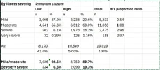
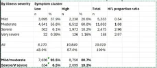
Percentage of patients in the HSBC per severity (and ratio (HS/LS)):

Mild/moderate: 53 % (1.15)
Severe: 80 % (3.98)
Very severe: 83 % (4.86)

Granted, there are only about 2500 severe and 150 very severe patients.
Thanks for this helpful reply.

I've been digging more into the numbers, and I'm not sure that the High symptom burden cluster is so much more severe than the low one.

This is the data from the supplementary table showing illness severity by symptom clusters. Please should if I have made any errors (you know what I'm like with typos etc. The stand out finding for me is that while the rate of severe and v severe illness is 3 x higher in the high symptom cluster, 80% of that still rate themselves as mild or moderate severity.

1783444109612.webp

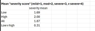
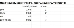
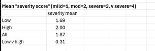
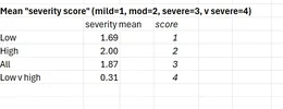
Another way to measure severity is to simply allocate a score to each severity level from 1 for mild to 4 to severe. And on this measure, the average symptom score difference is rather modest: 1.7 for low symptom vs 2.0 for high, Though 6.3% in the Low cluster are severe vs 19.5% in the High cluster.

1783452083394.webp
Symptom burden differences are reflected in significant but not huge illness severity differences, and a large majority in the High cluster are mild or moderate overall. So I wonder if "symptom burden" is an ambiguous term, and "symptom count" would be more accurate/less confusing.

Again, please shout if my numbers are wrong.
 

Attachments

  • 1783444212354.webp
    1783444212354.webp
    11.7 KB · Views: 35
Last edited:
Thank you @Simon M

I think something might have gone wrong with you tables, or my mobile browser is really messing with how it’s being displayed.

I agree that «symptom burden» is not ideal when talking about the number of symptoms and not the severity of symptoms. «Symptom count» like you suggest is much clearer.

My angle with my crude analysis was that you are much more likely to have a higher symptom count if you’re severe compared to being not severe. So not only do you have more severe symptoms, you also on average have a larger variety of symptoms to deal with.
 
I think something might have gone wrong with you tables, or my mobile browser is really messing with how it’s being displayed.
It looks like that in my browser (Safari on an iPad) some of the data has fallen out of the tables, making them very confusing,

Apologies - that looked great on my laptop, but what a mess. Now as screenprints, repeated below:
1783444126430.webp
1783452030452.webp


I agree that «symptom burden» is not ideal when talking about the number of symptoms and not the severity of symptoms. «Symptom count» like you suggest is much clearer.

My angle with my crude analysis was that you are much more likely to have a higher symptom count if you’re severe compared to being not severe. So not only do you have more severe symptoms, you also on average have a larger variety of symptoms to deal with.
I agree the severity difference is more impressive, and that having more severe illness tends to go with more symptoms too (though I think more severe symptoms can be at least as bad as more symptoms).

Separately, did you spot a symptom count threshold derived from the k clustering - presumably there is one?

But what struck me about the paper was that the clustering threw up a 2-cluster solution, even though 80% of the high-count cluster had moderate or mild illness. Which makes it harder to interpret, at least from my perspective.
 

Attachments

  • 1783444190504.webp
    1783444190504.webp
    11.7 KB · Views: 44
Last edited:
Thanks! How is the H/L proportion ratio in the first table calculated? It’s not the same as my ration when diving the number or severe in high by the number of severe in low.
Separately, did you spot a symptom count threshold derived from the k clustering - presumably there is one?
I did not see it in the main text but I don’t trust me to not miss it in my current brainfogged state.
But what struck me about the paper was that the clustering threw up a 2-cluster solution, even though 80% of the high-count cluster had moderate or mild illness. Which makes it harder to interpret, at least from my perspective.
Keep in mind that high/low are relative descriptions with the entire cohort as a reference range. If you tried to determine the high/low threshold for only the severe (&vs) and then apply it to the mod (&mild) you’d get fewer of the mod in the high group.

Without knowing how the method actually works, I would assume that the symptom counts if the mild/mod are the ones that primarily influenced the threshold because they made up most of the population.
 
The stand out finding for me is that while the rate of severe and v severe illness is 3 x higher in the high symptom cluster, 80% of that still rate themselves as mild or moderate severity.
But might this not simply reflect the inability of patients with severe to very severe cases to pay attention to all sorts of milder symptoms? --in the case of what is reported is the number of symptoms and not the intensity.
 
How is the H/L proportion ratio in the first table calculated? It’s not the same as my ration when diving the number or severe in high by the number of severe in low.
It's the relative rate/percentage in the High vs Low cluster, not the number, taking out the impact of the different cohort sizes, which is how the paper calculates it (though I get v slightly different figures).
I did not see it in the main text but I don’t trust me to not miss it in my current brainfogged state.
Ah - we are in the same boat
Keep in mind that high/low are relative descriptions with the entire cohort as a reference range. If you tried to determine the high/low threshold for only the severe (&vs) and then apply it to the mod (&mild) you’d get fewer of the mod in the high group.

Without knowing how the method actually works, I would assume that the symptom counts if the mild/mod are the ones that primarily influenced the threshold because they made up most of the population
They considered k= 2-10 as possible cluster sizes, and a two cluster solution was best. In other words, a solution that had the severe cases in a separate cluster performed less well You prompted me to try to understand the k-modes clustering method, more on that when i'm better informed, but I have discovered that it doesn't simply use symptom count. As the paper says (I must have skipped this initially)

The aim of this study is to identify groups of patients with similar symptom profiles using cluster analysis,
Though I think symptom count might be a factor driving similarity.
 
Isn't this what the results would look like if you don't find meaningful clusters or subgroups? Almost 50% split with only modest differences between the two groups.

The paper writes: "This large-scale cluster analysis of DecodeME symptom data reinforces that ME/CFS is a heterogeneous condition with clinical subtypes" but I would argue the results do not really suggest that.
 
It's the relative rate/percentage in the High vs Low cluster, not the number, taking out the impact of the different cohort sizes, which is how the paper calculates it (though I get v slightly different figures).
I’m not sure I understand the value of that ratii because it will be affected be the distribution of the other groups.

It’s essentially the chance of belonging to S when in H, divided by the chance of belonging to S when in L. What does that mean in practical terms? It seems backwards to how I’m used to thinking about things.

> P(S|H) / P(S|L)

If you rather look at the chance of belonging to H when in S, divided by the chance of belonging to L when in S, you can say something about how being in S affects the probability of being in H or L.

> P(H|S) / P(L|S)

I might be missing something completely obvious to the others.
They considered k= 2-10 as possible cluster sizes, and a two cluster solution was best. In other words, a solution that had the severe cases in a separate cluster performed less well You prompted me to try to understand the k-modes clustering method, more on that when i'm better informed, but I have discovered that it doesn't simply use symptom count. As the paper says (I must have skipped this initially)

Though I think symptom count might be a factor driving similarity.
Seeing as they are using «symptom burden» to describe «symptom count», I don’t think we can exclude the possibility that «symptom profile» could mean «symptom count».

I assume they tested bunching various types of symptoms into categories and found that it doesn’t give you any good separation, but the whole analysis part is way beyond my comprehension so I don’t know for sure.
 
Looking up the three rsIDs using OpenGWAS' PheWAS API endpoint to determine potential variant-trait associations, it was curious to note that for both rs341388 and rs60995367 there was an association with physical activity amongst the top 5 highest-ranked results by association p-value (rs341388:ukb-b-13702:"Time spent doing vigorous physical activity"; rs60995367:ukb-e-6164_p3_CSA:"Types of physical activity in last 4 weeks"). May be meaningless, of course.
 
They found that those in the more severe group were about 1.24 times more likely to have had an infectious trigger at the start of their ME/CFS compared to those with lower symptom burden.
One caveat here is that if you look at the raw numbers in supplementary table 2, the rate with infectious onset was almost identical. An infectious onset was reported by 61.1% in the high symptom burden group compared to 61.2% in the low symptom burden group. So this doesn't separate them at all.

The odds ratio was the result of a logistic regression that controlled for sex, age, deprivation, and ethnicity. But those variables were used to cluster the cohort into the two groups in the first place, so not sure if this analysis makes much sense.

A more straightforward analysis would simply test if infectious onset is associated with severity, regardless of the clusters!
 
The odds ratio was the result of a logistic regression that controlled for sex, age, deprivation, and ethnicity. But those variables were used to cluster the cohort into the two groups in the first place, so not sure if this analysis makes much sense.
I agree it's unconvincing given the raw data, and the author themselves point act that the association with "unknown Triggers" is as strong as that for infectious onset.

But I thought only symptom data was used for the clustering itself, and not age, sex et cetera?
 
Back
Top Bottom