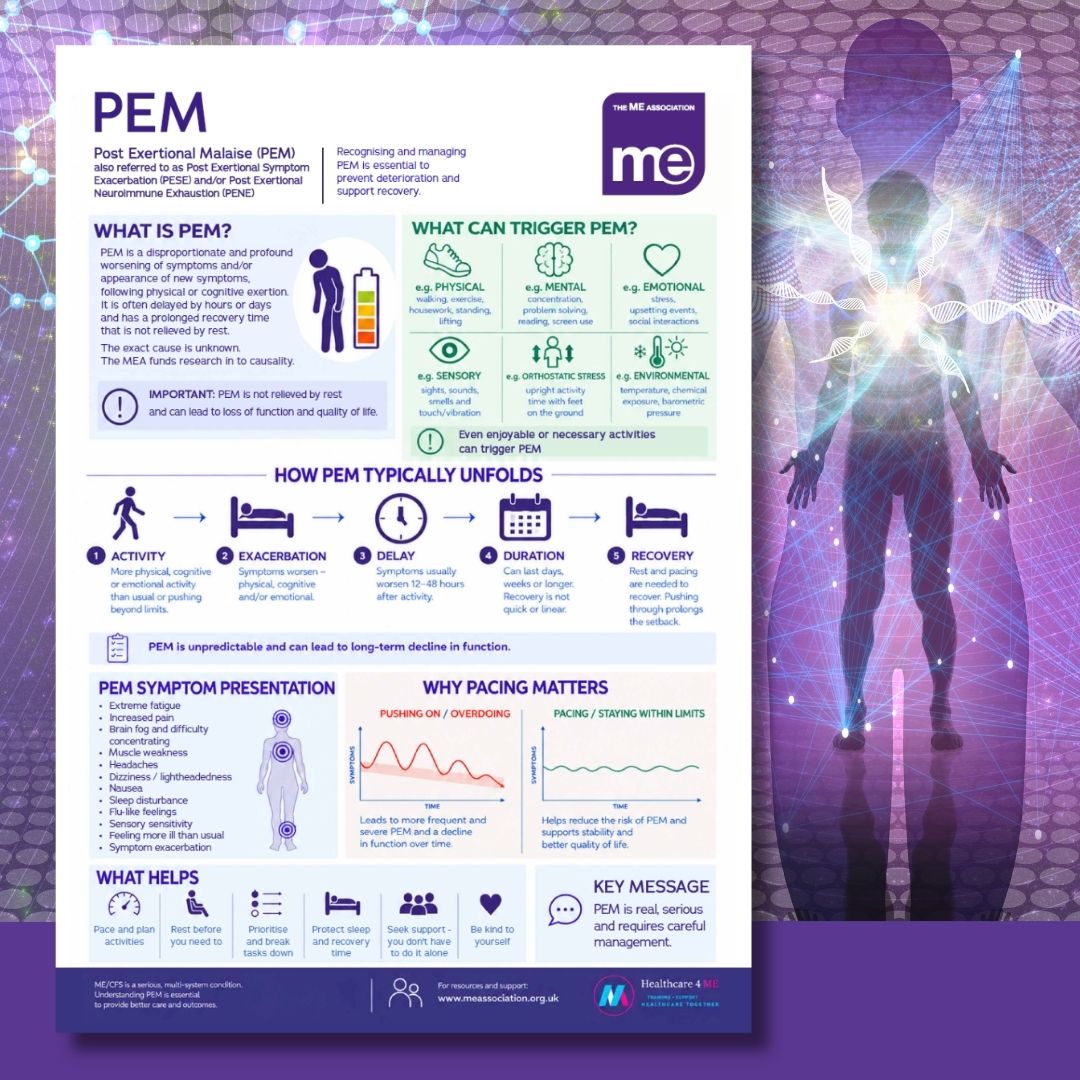
I thought at a glance the PEM infographic was a bit better than the causes one. But once I started actually reading it, there are so many illogocal and just plain wrong bits.
Like the graph that is supposed to be showing the effects of pushing on versus pacing. The vertical axis is labelled symptoms, so the pushing one seems to suggest symptoms gradually decline the more you push. Er, what???
And if you read the list of symptoms of PEM, they are just common symptoms of ME/CFS which worsen during PEM, not specifically PEM symptoms, and at the end of the list it lists Feeling more ill than usual, and Sympom exacerbation, neither of which is a specific symptom.
In the What is PEM section it's OK as far as it goes, but there's no mention of reduction of function.
It says not relieved by rest, but further down it says rest is essential to relieve PEM. That will cause confusion.
The How PEM unfolds seems to say that after the activity there is exacerbation and the picture is of a person in bed before the delay. And at the end of the unfolding, the person in bed is there again under the heading recovery. The whole thing looks illogical.
There is an isolated sentence in the middle about non recovery and long term decline I didn't even see on my first 2 read throughs. The eye is drawn on to the next illustrated section.



 I can’t help but feel it’s far more likely someone who no matter how well meaning they may be is either just very poorly informed or has been convinced or influenced by those with a specific agenda. It’s too specific a phrase and the wider direction of the MEA in this area seems clear.