ME Association- What Causes ME/CFS? A 3 stage hypothesis infographic

I don't really understand the criticism of the "predisposing, precipitating and perpetuating factors" model.

To me this jargon is entirely self-serving. It will mean nothing to most people other than that 'the person writing this thinks they are dropping pearls of wisdom'. It is used by people who don't actually have a grasp of what it might imply or the evidence for that. It is there to make physios sound clever.
 
but can't any acquired illness be thought of in this way?
Yes, but we don’t use that phrase to describe other aquired illnesses or diseases. If we did I wouldn’t have a problem with it but it would also be redundant. It is a phrase predominantly if not exclusively used by FND and BPS people AFAIK. In other words it is a dog whistle.

Edit: I just did a search for the phrase in a couple of search engines. It’s all BPS, psychology/mental health and mentions of FND and ‘CFS’.
 
Last edited:
Yes, but we don’t use that phrase to describe other aquired illnesses or diseases. If we did I wouldn’t have a problem with it but it would also be redundant. It is a phrase predominantly if not exclusively used by FND and BPS people AFAIK. In other words it is a dog whistle.

Edit: I just did a search for the phrase in a couple of search engines. It’s all BPS, psychology/mental health and mentions of FND and ‘CFS’.
It certainly seems most prevalent as the '4 P's' or '5 P's' in those circles.
 
The most annoying thing about the infographic for me is how PEM is tucked away at the bottom under 'muscle and mitochondrial dysfunction' which I think plays into the tendency elsewhere to define 'PEM' as just extra physical tiredness.
 
Maybe it's an attempt to reclaim the term? And at least it doesn't feature the 'boom and bust' stuff which BACME include in their perpetuating factors.
That’s a very generous view. I like your optimism :) I can’t help but feel it’s far more likely someone who no matter how well meaning they may be is either just very poorly informed or has been convinced or influenced by those with a specific agenda. It’s too specific a phrase and the wider direction of the MEA in this area seems clear.
 
That’s a very generous view. I like your optimism :) I can’t help but feel it’s far more likely someone who no matter how well meaning they may be is either just very poorly informed or has been convinced or influenced by those with a specific agenda. It’s too specific a phrase and the wider direction of the MEA in this area seems clear.

The chart and the leaflet it is derived from are on the MEA website as the work of Dr Charles Shepherd.
 
The chart and the leaflet it is derived from are on the MEA website as the work of Dr Charles Shepherd.
That’s a good point. Thanks for reiterating it. And the same three word phrase is used in there which is confusing and disappointing to see. It’s not used in there same way the BPS crowd use it though and although I haven’t read the whole leaflet it is clear on the biological underpinnings of the condition.
 
I don’t like how they are so definite about it.

One of the precipitating factors is “no obvious trigger”

The intro to perpetuating factors states they “could” be

If you don’t actually know what is precipitating or perpetuating then don't use that phrase as the basis of your poster!
 
I've given it one star and submitted this feedback. I'm very disappointed that the MEA is paying someone to produce this.

The target audience is unclear. No doctor is going to pick their way through it, and the tiny print makes it hard for sick patients to read. The division of symptoms into causal categories is unevidenced and the whole thing looks amateurish like a school project with a mix of patronising and overly scientific language that doesn't fit well with any audience. PEM the core symptom, is barely mentioned and not explained.
 
I get that putting allot of information in a graphic is hard. But all those arrows are really confusing. I think the intention is good, but the physical & mental stress bit is too simplistic for a graphic & is a huge loophole for bacme and people like that.
 
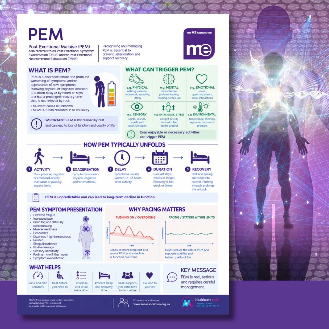
I thought at a glance the PEM infographic was a bit better than the causes one. But once I started actually reading it, there are so many illogocal and just plain wrong bits.

Like the graph that is supposed to be showing the effects of pushing on versus pacing. The vertical axis is labelled symptoms, so the pushing one seems to suggest symptoms gradually decline the more you push. Er, what???

And if you read the list of symptoms of PEM, they are just common symptoms of ME/CFS which worsen during PEM, not specifically PEM symptoms, and at the end of the list it lists Feeling more ill than usual, and Sympom exacerbation, neither of which is a specific symptom.

In the What is PEM section it's OK as far as it goes, but there's no mention of reduction of function.
It says not relieved by rest, but further down it says rest is essential to relieve PEM. That will cause confusion.

The How PEM unfolds seems to say that after the activity there is exacerbation and the picture is of a person in bed before the delay. And at the end of the unfolding, the person in bed is there again under the heading recovery. The whole thing looks illogical.

There is an isolated sentence in the middle about non recovery and long term decline I didn't even see on my first 2 read throughs. The eye is drawn on to the next illustrated section.

 
The How PEM unfolds seems to say that after the activity there is exacerbation and the picture is of a person in bed before the delay. And at the end of the unfolding, the person in bed is there again under the heading recovery. The whole thing looks illogical.

Just how the fatigue clinics would explain it - 'You see, they take to their beds as soon as they feel symptoms, which causes deconditioning, so they feel ill when they try to get up again.'
 
Back
Top Bottom